
BRANDING | POSTED ON 11.08.2013
Winter Olympics Branding for 2018 is All About Harmony
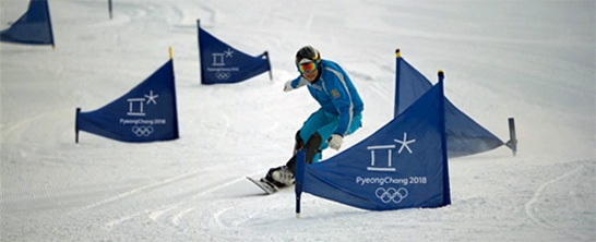
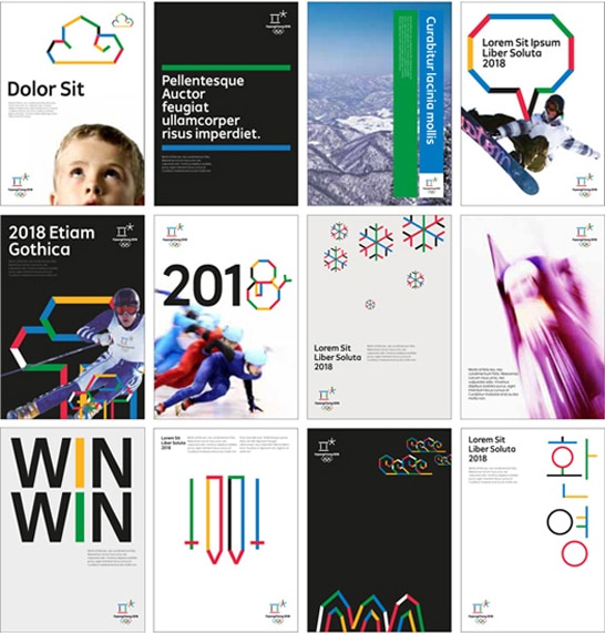
PyeongChang, South Korea, will be hosting the XXIII Olympic Winter Games in 2018. Back in May, the Organising Committee revealed the branding for the games. The logo is inspired by Hangul (the Korean alphabet) and the oriental philosophy; heaven, earth and the harmony of people. The open square emblem symbolises an open space where people from around the world can come together and celebrate. It is also inspired by snow, ice and the star of winter sports. The colours used for the logo were not only inspired by the Olympic rings, but the Korean 5 cardinal colours. Attached at the bottom is a very generic sans serif logotype. The use of straight lines creates a very minimal and clean look and because these graphic elements are used on all their marketing collateral, the brand becomes very recognisable. When the elements are animated it shows how welcoming, playful and energetic the event will be.
![]()
![]()
 https://liquidcreativity.com.au/wp-content/uploads/2023/09/How-to-avoid-the-top-10-brand-naming-mistakes-Header.png
1384
2560
Nikhil Makwana
https://liquidcreativity.com.au/wp-content/uploads/2016/03/liquid_logo.svg
Nikhil Makwana2023-09-27 01:45:282023-10-02 09:34:59How To Avoid The Top 10 Brand Naming Mistakes
https://liquidcreativity.com.au/wp-content/uploads/2023/09/How-to-avoid-the-top-10-brand-naming-mistakes-Header.png
1384
2560
Nikhil Makwana
https://liquidcreativity.com.au/wp-content/uploads/2016/03/liquid_logo.svg
Nikhil Makwana2023-09-27 01:45:282023-10-02 09:34:59How To Avoid The Top 10 Brand Naming Mistakes https://liquidcreativity.com.au/wp-content/uploads/2023/07/create-a-successful-brand-identity.png
1384
2560
Liquid Designers
https://liquidcreativity.com.au/wp-content/uploads/2016/03/liquid_logo.svg
Liquid Designers2023-07-18 12:45:152023-08-16 15:01:28How To Create A Successful Brand Identity: A Step-By-Step Guide
https://liquidcreativity.com.au/wp-content/uploads/2023/07/create-a-successful-brand-identity.png
1384
2560
Liquid Designers
https://liquidcreativity.com.au/wp-content/uploads/2016/03/liquid_logo.svg
Liquid Designers2023-07-18 12:45:152023-08-16 15:01:28How To Create A Successful Brand Identity: A Step-By-Step Guide https://liquidcreativity.com.au/wp-content/uploads/2023/07/how-to-conduct-brand-audit.png
1384
2560
Liquid Designers
https://liquidcreativity.com.au/wp-content/uploads/2016/03/liquid_logo.svg
Liquid Designers2023-07-18 11:49:382023-08-09 20:26:56How To Conduct A Brand Audit: A Step-By-Step Guide
https://liquidcreativity.com.au/wp-content/uploads/2023/07/how-to-conduct-brand-audit.png
1384
2560
Liquid Designers
https://liquidcreativity.com.au/wp-content/uploads/2016/03/liquid_logo.svg
Liquid Designers2023-07-18 11:49:382023-08-09 20:26:56How To Conduct A Brand Audit: A Step-By-Step Guide https://liquidcreativity.com.au/wp-content/uploads/2021/03/Adding-value-to-your-brand.png
471
871
Liquid Designers
https://liquidcreativity.com.au/wp-content/uploads/2016/03/liquid_logo.svg
Liquid Designers2021-04-01 20:56:492023-07-19 02:28:07How to Add Value to Your Brand and How to Communicate This to Your Customers
https://liquidcreativity.com.au/wp-content/uploads/2021/03/Adding-value-to-your-brand.png
471
871
Liquid Designers
https://liquidcreativity.com.au/wp-content/uploads/2016/03/liquid_logo.svg
Liquid Designers2021-04-01 20:56:492023-07-19 02:28:07How to Add Value to Your Brand and How to Communicate This to Your Customers https://liquidcreativity.com.au/wp-content/uploads/2021/03/making-business-decision-making-easier.png
471
871
Liquid Designers
https://liquidcreativity.com.au/wp-content/uploads/2016/03/liquid_logo.svg
Liquid Designers2021-03-30 20:04:032023-07-19 02:49:37A marketing expert’s tips on simplifying business decision making
https://liquidcreativity.com.au/wp-content/uploads/2021/03/making-business-decision-making-easier.png
471
871
Liquid Designers
https://liquidcreativity.com.au/wp-content/uploads/2016/03/liquid_logo.svg
Liquid Designers2021-03-30 20:04:032023-07-19 02:49:37A marketing expert’s tips on simplifying business decision making

Leave a Reply
Your email address will not be published