LOGO | POSTED ON 09.06.2015
The Birth of the Iconic Apple Logo
Sometimes things just all fall into place. A simple idea, a short turn around and yet it all just works.
While you may not be familiar with the name Rob Janoff, we guarantee you are familiar with his work. How do we know this? He is the creator of the iconic Apple logo – the same design used today to represent one of the largest organisations in the world.
You can read more about the Apple logo story on Rob’s website but it goes a bit like this:
‘The initial identity development was to coincide with the introduction of the brand’s first personal computer, the Apple II. The entire design process with the upstart client only took about two weeks. After the agency’s initial meeting, Janoff went to work developing the Apple icon based on his examination of physical cross-sections of real apples. A single design illustration was then created of a ‘rainbow-striped’ apple.
The design with its multi-colored stripes was promptly approved for production by Steve Jobs. Production artwork was then developed for print ads, signage hardware emblems and software labels on cassette tapes, all in preparation for the launch of the Apple II in April of 1977 at the West Coast Computer Fair. For the next 20 years, the now famous ‘rainbow version’ logo adorned all Apple products from its computer products to the Newton PDA. The only concept ever presented to Apple was an immediate success!’


‘The creative director thought I had a good way of simplifying and visualising difficult electronic concepts. I knew all the tech kind of stuff went on in Silicon Valley but I was never enough of a computer geek to really understand how it worked.’ – Rob Janoff
Why has the logo been so successful and still stands the test of time? Well it all comes down to the fact that it ticks off all the basics of logo design.
- It’s clean and simple;
- It didn’t follow the trend of the time which tended to be more intricate/fussy designs;
- It’s use of colour (both now and back then) aligns with both the market and the product offering;
- It’s not changed too frequently – the core design hasn’t change since the very beginning – allowing the company to build unprecedented brand recognition;
- It wasn’t too literal – an apple but not selling fruit, selling computers;
- It didn’t copy anyone else;
- It couldn’t use too many fonts – in fact, the logo doesn’t include any words at all simply because the design meant that it didn’t need it;
- It worked/works in a range of contexts and sizes (from the products to billboards) without losing legibility;
- It offered a unique point of difference.
‘A lot of people ask me what it’s like seeing your logo every time you turn around. It’s a fabulous experience and it’s rare. I don’t think a lot of people get that opportunity. Watching what I created in the ’70s go through changes is kind of like having kids and watching them grow up. I’m terribly proud of my kids and I’m terribly proud of the logo as well.’ – Rob Janoff
Another great example of a single design idea evolving through the years and the changing markets is Shell (below).
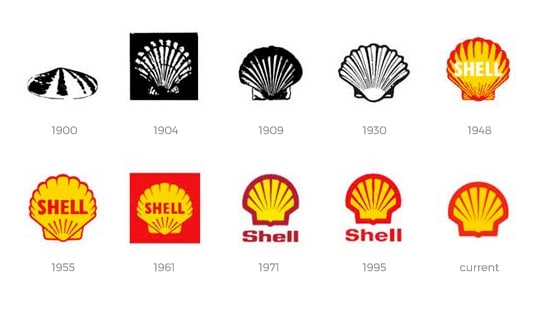
Not all, in fact hardly any, logo design processes are as simple and as fast as the process for the iconic Apple logo but it definitely highlights how a great, professional design can stand the test of time and evolve with the market.
To learn more, contact your local brand agency Liquid Creativity today.
 https://liquidcreativity.com.au/wp-content/uploads/2018/11/is-my-brand-okay.png
471
871
Liquid Designers
https://liquidcreativity.com.au/wp-content/uploads/2016/03/liquid_logo.svg
Liquid Designers2018-11-14 09:01:432023-07-19 02:58:23Is My Brand Okay?
https://liquidcreativity.com.au/wp-content/uploads/2018/11/is-my-brand-okay.png
471
871
Liquid Designers
https://liquidcreativity.com.au/wp-content/uploads/2016/03/liquid_logo.svg
Liquid Designers2018-11-14 09:01:432023-07-19 02:58:23Is My Brand Okay? https://liquidcreativity.com.au/wp-content/uploads/2018/08/Brand_Visual_Language.png
471
871
Liquid Designers
https://liquidcreativity.com.au/wp-content/uploads/2016/03/liquid_logo.svg
Liquid Designers2018-08-22 09:49:422023-07-19 02:58:31Your Business Needs a Brand Visual Language
https://liquidcreativity.com.au/wp-content/uploads/2018/08/Brand_Visual_Language.png
471
871
Liquid Designers
https://liquidcreativity.com.au/wp-content/uploads/2016/03/liquid_logo.svg
Liquid Designers2018-08-22 09:49:422023-07-19 02:58:31Your Business Needs a Brand Visual Language https://liquidcreativity.com.au/wp-content/uploads/2018/06/Crumpler_rebrand_blog_v1a-01-1.png
471
871
Liquid Designers
https://liquidcreativity.com.au/wp-content/uploads/2016/03/liquid_logo.svg
Liquid Designers2018-06-06 10:20:402023-07-19 02:58:52A Look at Crumpler’s Rebrand
https://liquidcreativity.com.au/wp-content/uploads/2018/06/Crumpler_rebrand_blog_v1a-01-1.png
471
871
Liquid Designers
https://liquidcreativity.com.au/wp-content/uploads/2016/03/liquid_logo.svg
Liquid Designers2018-06-06 10:20:402023-07-19 02:58:52A Look at Crumpler’s Rebrand https://liquidcreativity.com.au/wp-content/uploads/2018/05/Brand-Guide-Build-up-your-branding.png
1384
2560
Liquid Designers
https://liquidcreativity.com.au/wp-content/uploads/2016/03/liquid_logo.svg
Liquid Designers2018-05-17 11:17:222023-07-19 02:59:02How to Build a Brand: A Business Owner’s Guide
https://liquidcreativity.com.au/wp-content/uploads/2018/05/Brand-Guide-Build-up-your-branding.png
1384
2560
Liquid Designers
https://liquidcreativity.com.au/wp-content/uploads/2016/03/liquid_logo.svg
Liquid Designers2018-05-17 11:17:222023-07-19 02:59:02How to Build a Brand: A Business Owner’s Guide https://liquidcreativity.com.au/wp-content/uploads/2018/05/Pulse_case_study_Blog_v1d-09.png
472
871
Liquid Designers
https://liquidcreativity.com.au/wp-content/uploads/2016/03/liquid_logo.svg
Liquid Designers2018-05-02 09:50:402023-07-19 02:59:15Pulse: Creating a Brand for a New Digital Platform
https://liquidcreativity.com.au/wp-content/uploads/2018/05/Pulse_case_study_Blog_v1d-09.png
472
871
Liquid Designers
https://liquidcreativity.com.au/wp-content/uploads/2016/03/liquid_logo.svg
Liquid Designers2018-05-02 09:50:402023-07-19 02:59:15Pulse: Creating a Brand for a New Digital Platform https://liquidcreativity.com.au/wp-content/uploads/2018/01/Branding_Trends_2018.png
471
871
Liquid Designers
https://liquidcreativity.com.au/wp-content/uploads/2016/03/liquid_logo.svg
Liquid Designers2018-01-18 15:45:312023-07-19 03:04:41Branding and Design Trends to Keep an Eye on in 2020
https://liquidcreativity.com.au/wp-content/uploads/2018/01/Branding_Trends_2018.png
471
871
Liquid Designers
https://liquidcreativity.com.au/wp-content/uploads/2016/03/liquid_logo.svg
Liquid Designers2018-01-18 15:45:312023-07-19 03:04:41Branding and Design Trends to Keep an Eye on in 2020
A new patent filing from Apple suggests that it’s working on ways to make the logo on your device change colour and even surface texture. And while there’s no way this is going to take effect in time for this year’s Apple Black Friday deals – or even next year or the year after that – it could eventually change the way we look at Apple devices.