
PACKAGING | POSTED ON 07.07.2012
Tesco’s Cream Looks Yummy on this New Packaging
The brief to redesign Tesco’s range of fresh cream, covering over a massive 30 lines, created an impressive design challenge. The idea behind the new packaging design was to create a quality seal that takes visual cues from old fashioned dairy cream pots. Bold typography is used to highlight the cream type, this is supported by strong colour coding of the seal that follows sector language. This strong simple idea was able to adapt across the various pot sizes and lids. The product information which previously included recipe ideas and other less relevant information, was stripped back to its product essence within the redesign process.
The design also worked well when applied across range extensions such as Soured Cream and Crème Fraiche. The new brand design achieves a consistent look across the range, a strong shelf presence and succeeds in making the range much easier to shop.
 https://liquidcreativity.com.au/wp-content/uploads/2016/02/mova_icecream01.jpg
471
871
Liquid Designers
https://liquidcreativity.com.au/wp-content/uploads/2016/03/liquid_logo.svg
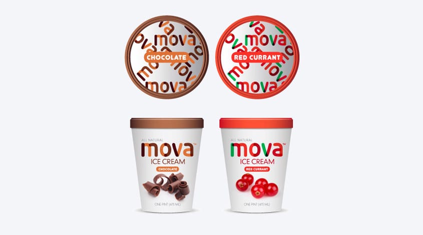
Liquid Designers2014-08-26 14:50:162022-10-20 18:07:27US Market – Meet our Clean Packaging Design
https://liquidcreativity.com.au/wp-content/uploads/2016/02/mova_icecream01.jpg
471
871
Liquid Designers
https://liquidcreativity.com.au/wp-content/uploads/2016/03/liquid_logo.svg
Liquid Designers2014-08-26 14:50:162022-10-20 18:07:27US Market – Meet our Clean Packaging Design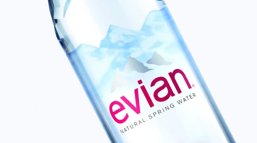 https://liquidcreativity.com.au/wp-content/uploads/2016/02/evian_01.jpg
471
871
Liquid Designers
https://liquidcreativity.com.au/wp-content/uploads/2016/03/liquid_logo.svg
Liquid Designers2014-08-11 09:21:482022-10-20 19:37:24New Evian Bottle Design is Sleek and Clean
https://liquidcreativity.com.au/wp-content/uploads/2016/02/evian_01.jpg
471
871
Liquid Designers
https://liquidcreativity.com.au/wp-content/uploads/2016/03/liquid_logo.svg
Liquid Designers2014-08-11 09:21:482022-10-20 19:37:24New Evian Bottle Design is Sleek and Clean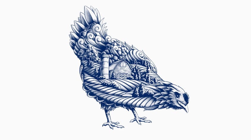 https://liquidcreativity.com.au/wp-content/uploads/2016/02/blue_goose_07.jpg
471
871
Liquid Designers
https://liquidcreativity.com.au/wp-content/uploads/2016/03/liquid_logo.svg
Liquid Designers2014-07-11 11:46:262022-10-20 18:33:23Blue Goose new packaging is naturally good
https://liquidcreativity.com.au/wp-content/uploads/2016/02/blue_goose_07.jpg
471
871
Liquid Designers
https://liquidcreativity.com.au/wp-content/uploads/2016/03/liquid_logo.svg
Liquid Designers2014-07-11 11:46:262022-10-20 18:33:23Blue Goose new packaging is naturally good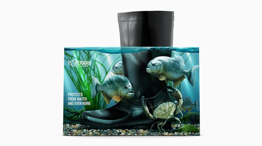 https://liquidcreativity.com.au/wp-content/uploads/2016/02/fisherman_01.jpg
471
871
Liquid Designers
https://liquidcreativity.com.au/wp-content/uploads/2016/03/liquid_logo.svg
Liquid Designers2014-07-07 16:18:552022-10-20 22:12:55These Boots Are Made For Walking (On Water)
https://liquidcreativity.com.au/wp-content/uploads/2016/02/fisherman_01.jpg
471
871
Liquid Designers
https://liquidcreativity.com.au/wp-content/uploads/2016/03/liquid_logo.svg
Liquid Designers2014-07-07 16:18:552022-10-20 22:12:55These Boots Are Made For Walking (On Water)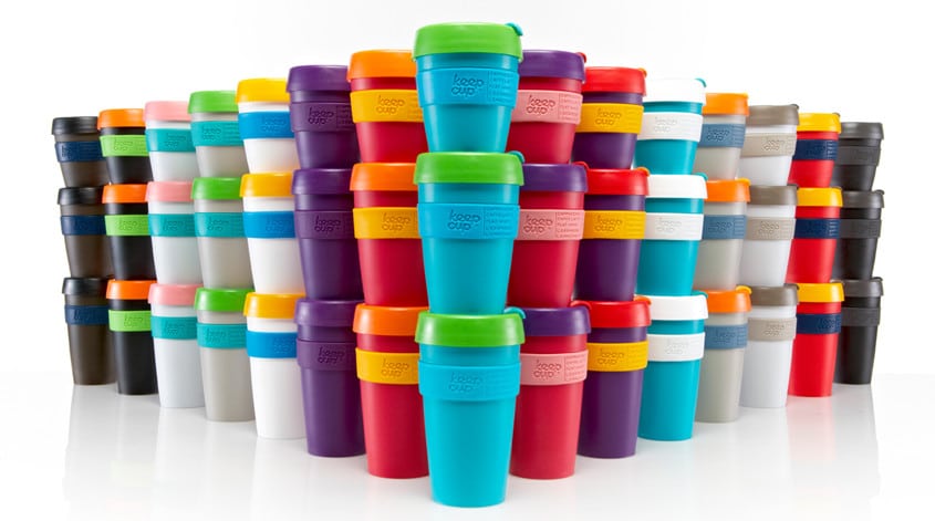 https://liquidcreativity.com.au/wp-content/uploads/2016/02/keepcup_01.jpg
471
871
Liquid Designers
https://liquidcreativity.com.au/wp-content/uploads/2016/03/liquid_logo.svg
Liquid Designers2014-07-01 11:01:062021-10-25 17:55:03A Brand Strategy to Keep(Cup) – Branding Strategies to Grow Your Business
https://liquidcreativity.com.au/wp-content/uploads/2016/02/keepcup_01.jpg
471
871
Liquid Designers
https://liquidcreativity.com.au/wp-content/uploads/2016/03/liquid_logo.svg
Liquid Designers2014-07-01 11:01:062021-10-25 17:55:03A Brand Strategy to Keep(Cup) – Branding Strategies to Grow Your Business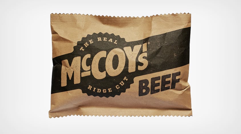 https://liquidcreativity.com.au/wp-content/uploads/2016/02/mccoys01.jpg
471
871
Liquid Designers
https://liquidcreativity.com.au/wp-content/uploads/2016/03/liquid_logo.svg
Liquid Designers2014-06-17 09:27:592022-10-20 22:07:46The Real Man’s Chips
https://liquidcreativity.com.au/wp-content/uploads/2016/02/mccoys01.jpg
471
871
Liquid Designers
https://liquidcreativity.com.au/wp-content/uploads/2016/03/liquid_logo.svg
Liquid Designers2014-06-17 09:27:592022-10-20 22:07:46The Real Man’s Chips

Leave a Reply
Your email address will not be published