LOGO | POSTED ON 06.08.2013
A Simplified Logo to Make the Fox Look Hot on Mobile
Back in June, Mozilla revealed a simplified logo for Firefox, its first since 2009. And they clearly stated that the simplified logo was ‘created specifically with the mobile in mind’ and ‘it’s been optimised to be crisper and cleaner’ on smaller screens. It’s pretty much a more simple design in terms of colours, detail and shape. One major difference is that the globe is no longer super glossy and has a softer deeper colour. The fox has less detail in it’s fur and a lighter colour, while the arm now extends from it’s shoulders instead of under its chest.
![]()
Simplicity is the key to effective communication and a company needs to continually assess their design effectiveness. Due to the increased use of mobile devices, consumers are now accessing information on smaller devices and therefore the imagery and graphics need to adapt to that reality. Simplicity of graphics has always been a more effective way to design, but now it’s becoming essential as the detail gets lost when viewed on smaller screens.
 https://liquidcreativity.com.au/wp-content/uploads/2018/11/is-my-brand-okay.png
471
871
Liquid Designers
https://liquidcreativity.com.au/wp-content/uploads/2016/03/liquid_logo.svg
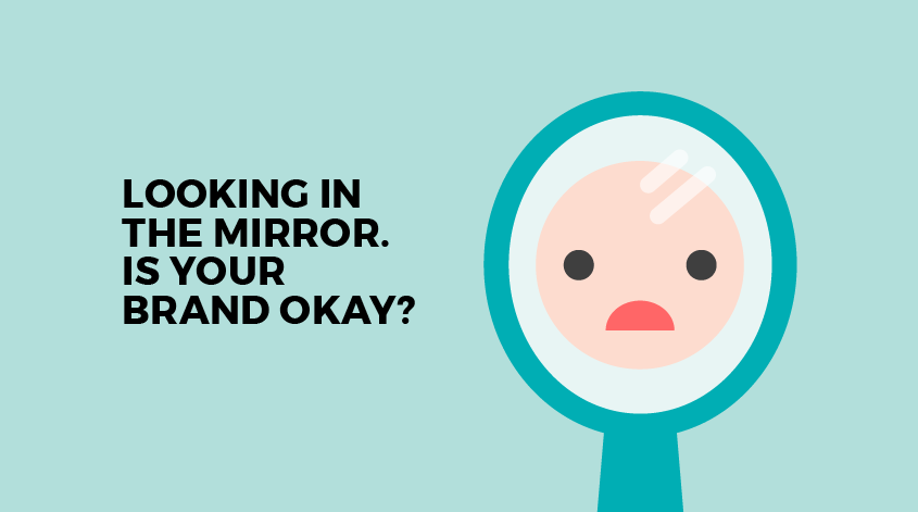
Liquid Designers2018-11-14 09:01:432023-07-19 02:58:23Is My Brand Okay?
https://liquidcreativity.com.au/wp-content/uploads/2018/11/is-my-brand-okay.png
471
871
Liquid Designers
https://liquidcreativity.com.au/wp-content/uploads/2016/03/liquid_logo.svg
Liquid Designers2018-11-14 09:01:432023-07-19 02:58:23Is My Brand Okay?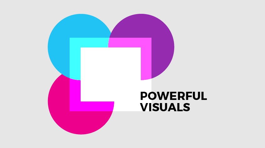 https://liquidcreativity.com.au/wp-content/uploads/2018/08/Brand_Visual_Language.png
471
871
Liquid Designers
https://liquidcreativity.com.au/wp-content/uploads/2016/03/liquid_logo.svg
Liquid Designers2018-08-22 09:49:422023-07-19 02:58:31Your Business Needs a Brand Visual Language
https://liquidcreativity.com.au/wp-content/uploads/2018/08/Brand_Visual_Language.png
471
871
Liquid Designers
https://liquidcreativity.com.au/wp-content/uploads/2016/03/liquid_logo.svg
Liquid Designers2018-08-22 09:49:422023-07-19 02:58:31Your Business Needs a Brand Visual Language https://liquidcreativity.com.au/wp-content/uploads/2018/06/Crumpler_rebrand_blog_v1a-01-1.png
471
871
Liquid Designers
https://liquidcreativity.com.au/wp-content/uploads/2016/03/liquid_logo.svg
Liquid Designers2018-06-06 10:20:402023-07-19 02:58:52A Look at Crumpler’s Rebrand
https://liquidcreativity.com.au/wp-content/uploads/2018/06/Crumpler_rebrand_blog_v1a-01-1.png
471
871
Liquid Designers
https://liquidcreativity.com.au/wp-content/uploads/2016/03/liquid_logo.svg
Liquid Designers2018-06-06 10:20:402023-07-19 02:58:52A Look at Crumpler’s Rebrand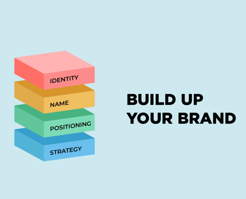 https://liquidcreativity.com.au/wp-content/uploads/2018/05/Brand-Guide-Build-up-your-branding.png
1384
2560
Liquid Designers
https://liquidcreativity.com.au/wp-content/uploads/2016/03/liquid_logo.svg
Liquid Designers2018-05-17 11:17:222023-07-19 02:59:02How to Build a Brand: A Business Owner’s Guide
https://liquidcreativity.com.au/wp-content/uploads/2018/05/Brand-Guide-Build-up-your-branding.png
1384
2560
Liquid Designers
https://liquidcreativity.com.au/wp-content/uploads/2016/03/liquid_logo.svg
Liquid Designers2018-05-17 11:17:222023-07-19 02:59:02How to Build a Brand: A Business Owner’s Guide https://liquidcreativity.com.au/wp-content/uploads/2018/05/Pulse_case_study_Blog_v1d-09.png
472
871
Liquid Designers
https://liquidcreativity.com.au/wp-content/uploads/2016/03/liquid_logo.svg
Liquid Designers2018-05-02 09:50:402023-07-19 02:59:15Pulse: Creating a Brand for a New Digital Platform
https://liquidcreativity.com.au/wp-content/uploads/2018/05/Pulse_case_study_Blog_v1d-09.png
472
871
Liquid Designers
https://liquidcreativity.com.au/wp-content/uploads/2016/03/liquid_logo.svg
Liquid Designers2018-05-02 09:50:402023-07-19 02:59:15Pulse: Creating a Brand for a New Digital Platform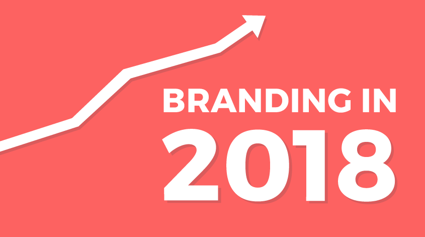 https://liquidcreativity.com.au/wp-content/uploads/2018/01/Branding_Trends_2018.png
471
871
Liquid Designers
https://liquidcreativity.com.au/wp-content/uploads/2016/03/liquid_logo.svg
Liquid Designers2018-01-18 15:45:312023-07-19 03:04:41Branding and Design Trends to Keep an Eye on in 2020
https://liquidcreativity.com.au/wp-content/uploads/2018/01/Branding_Trends_2018.png
471
871
Liquid Designers
https://liquidcreativity.com.au/wp-content/uploads/2016/03/liquid_logo.svg
Liquid Designers2018-01-18 15:45:312023-07-19 03:04:41Branding and Design Trends to Keep an Eye on in 2020

Leave a Reply
Your email address will not be published