Posts
 https://liquidcreativity.com.au/wp-content/uploads/2016/02/farmers_15_seconds_of_smart.jpg
471
871
Liquid Designers
https://liquidcreativity.com.au/wp-content/uploads/2016/03/liquid_logo.svg
Liquid Designers2014-08-07 09:37:472022-10-20 18:53:25Farmers Insurance Rebrands to Fit a New Era
https://liquidcreativity.com.au/wp-content/uploads/2016/02/farmers_15_seconds_of_smart.jpg
471
871
Liquid Designers
https://liquidcreativity.com.au/wp-content/uploads/2016/03/liquid_logo.svg
Liquid Designers2014-08-07 09:37:472022-10-20 18:53:25Farmers Insurance Rebrands to Fit a New Era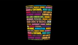 https://liquidcreativity.com.au/wp-content/uploads/2016/02/subzero_icecream_01.jpg
471
871
Liquid Designers
https://liquidcreativity.com.au/wp-content/uploads/2016/03/liquid_logo.svg
Liquid Designers2014-07-31 09:32:392022-10-20 22:04:16Subzero Ice Cream Becomes Hot As Hell
https://liquidcreativity.com.au/wp-content/uploads/2016/02/subzero_icecream_01.jpg
471
871
Liquid Designers
https://liquidcreativity.com.au/wp-content/uploads/2016/03/liquid_logo.svg
Liquid Designers2014-07-31 09:32:392022-10-20 22:04:16Subzero Ice Cream Becomes Hot As Hell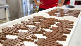 https://liquidcreativity.com.au/wp-content/uploads/2016/02/android_kitkat_01.jpg
471
871
Liquid Designers
https://liquidcreativity.com.au/wp-content/uploads/2016/03/liquid_logo.svg
Liquid Designers2014-07-14 11:26:382022-11-07 22:33:22Google & KitKat Brand Strategy
https://liquidcreativity.com.au/wp-content/uploads/2016/02/android_kitkat_01.jpg
471
871
Liquid Designers
https://liquidcreativity.com.au/wp-content/uploads/2016/03/liquid_logo.svg
Liquid Designers2014-07-14 11:26:382022-11-07 22:33:22Google & KitKat Brand Strategy https://liquidcreativity.com.au/wp-content/uploads/2016/02/bookworld_01.jpg
471
871
Liquid Designers
https://liquidcreativity.com.au/wp-content/uploads/2016/03/liquid_logo.svg
Liquid Designers2014-07-04 00:22:492022-10-20 18:26:02A rebranding process to fight the Amazonians
https://liquidcreativity.com.au/wp-content/uploads/2016/02/bookworld_01.jpg
471
871
Liquid Designers
https://liquidcreativity.com.au/wp-content/uploads/2016/03/liquid_logo.svg
Liquid Designers2014-07-04 00:22:492022-10-20 18:26:02A rebranding process to fight the Amazonians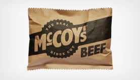 https://liquidcreativity.com.au/wp-content/uploads/2016/02/mccoys01.jpg
471
871
Liquid Designers
https://liquidcreativity.com.au/wp-content/uploads/2016/03/liquid_logo.svg
Liquid Designers2014-06-17 09:27:592022-10-20 22:07:46The Real Man’s Chips
https://liquidcreativity.com.au/wp-content/uploads/2016/02/mccoys01.jpg
471
871
Liquid Designers
https://liquidcreativity.com.au/wp-content/uploads/2016/03/liquid_logo.svg
Liquid Designers2014-06-17 09:27:592022-10-20 22:07:46The Real Man’s Chips https://liquidcreativity.com.au/wp-content/uploads/2014/05/yellow_pages_video_frame.jpg
471
871
Liquid Designers
https://liquidcreativity.com.au/wp-content/uploads/2016/03/liquid_logo.svg
Liquid Designers2014-05-27 10:00:162022-11-08 13:50:48YP Rebrands and is Now a Service Brand for ‘Doers’
https://liquidcreativity.com.au/wp-content/uploads/2014/05/yellow_pages_video_frame.jpg
471
871
Liquid Designers
https://liquidcreativity.com.au/wp-content/uploads/2016/03/liquid_logo.svg
Liquid Designers2014-05-27 10:00:162022-11-08 13:50:48YP Rebrands and is Now a Service Brand for ‘Doers’ https://liquidcreativity.com.au/wp-content/uploads/2016/02/opera_australia_brochure_cover.jpg
471
871
Liquid Designers
https://liquidcreativity.com.au/wp-content/uploads/2016/03/liquid_logo.svg
Liquid Designers2014-05-09 07:05:502022-10-20 18:24:12A Rebrand to Open up Opera Australia
https://liquidcreativity.com.au/wp-content/uploads/2016/02/opera_australia_brochure_cover.jpg
471
871
Liquid Designers
https://liquidcreativity.com.au/wp-content/uploads/2016/03/liquid_logo.svg
Liquid Designers2014-05-09 07:05:502022-10-20 18:24:12A Rebrand to Open up Opera Australia https://liquidcreativity.com.au/wp-content/uploads/2016/02/tigerair_blog.jpg
471
871
Liquid Designers
https://liquidcreativity.com.au/wp-content/uploads/2016/03/liquid_logo.svg
Liquid Designers2013-08-15 16:06:002022-10-20 22:02:39The Tiger Changed its Stripes and Now Wants to Fly High
https://liquidcreativity.com.au/wp-content/uploads/2016/02/tigerair_blog.jpg
471
871
Liquid Designers
https://liquidcreativity.com.au/wp-content/uploads/2016/03/liquid_logo.svg
Liquid Designers2013-08-15 16:06:002022-10-20 22:02:39The Tiger Changed its Stripes and Now Wants to Fly High https://liquidcreativity.com.au/wp-content/uploads/2016/02/art_blog.jpg
471
871
Liquid Designers
https://liquidcreativity.com.au/wp-content/uploads/2016/03/liquid_logo.svg
Liquid Designers2013-05-24 07:12:112021-10-26 16:42:33Rebranding Increased Visitors and Product Sales
https://liquidcreativity.com.au/wp-content/uploads/2016/02/art_blog.jpg
471
871
Liquid Designers
https://liquidcreativity.com.au/wp-content/uploads/2016/03/liquid_logo.svg
Liquid Designers2013-05-24 07:12:112021-10-26 16:42:33Rebranding Increased Visitors and Product Sales https://liquidcreativity.com.au/wp-content/uploads/2016/02/carmans_blog.jpg
471
871
Liquid Designers
https://liquidcreativity.com.au/wp-content/uploads/2016/03/liquid_logo.svg
Liquid Designers2013-04-02 06:00:222022-11-07 23:19:52Adding a Friendly Personality to the Carman’s Brand
https://liquidcreativity.com.au/wp-content/uploads/2016/02/carmans_blog.jpg
471
871
Liquid Designers
https://liquidcreativity.com.au/wp-content/uploads/2016/03/liquid_logo.svg
Liquid Designers2013-04-02 06:00:222022-11-07 23:19:52Adding a Friendly Personality to the Carman’s Brand https://liquidcreativity.com.au/wp-content/uploads/2016/02/virgin_blog.jpg
471
871
Liquid Designers
https://liquidcreativity.com.au/wp-content/uploads/2016/03/liquid_logo.svg
Liquid Designers2013-03-30 05:54:312021-10-26 18:16:14Virgin Australia’s Unified Brand Takes Them High Up
https://liquidcreativity.com.au/wp-content/uploads/2016/02/virgin_blog.jpg
471
871
Liquid Designers
https://liquidcreativity.com.au/wp-content/uploads/2016/03/liquid_logo.svg
Liquid Designers2013-03-30 05:54:312021-10-26 18:16:14Virgin Australia’s Unified Brand Takes Them High Up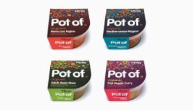 https://liquidcreativity.com.au/wp-content/uploads/2016/02/pot_of_blog.jpg
471
871
Liquid Designers
https://liquidcreativity.com.au/wp-content/uploads/2016/03/liquid_logo.svg
Liquid Designers2012-06-01 03:31:462021-10-25 17:01:45A Brand ‘Pot of’ Difference On and Off the Shelf
https://liquidcreativity.com.au/wp-content/uploads/2016/02/pot_of_blog.jpg
471
871
Liquid Designers
https://liquidcreativity.com.au/wp-content/uploads/2016/03/liquid_logo.svg
Liquid Designers2012-06-01 03:31:462021-10-25 17:01:45A Brand ‘Pot of’ Difference On and Off the Shelf