They must be enabled to be viewed and resized to suit the ever increasingly popular mobile app devices – smartphone, tablets, smartwatches – but in ensuring they are functioning correctly on these devices, we may have overlooked a very important aspect – our logo!
As devices get smaller and design for them more ‘square’ – where does that leave the round, circular, often icon circle logo? For some round logos like ours (Liquid Creativity) they work equally well on all devices – retaining a beautiful circle for others, they may need to be reworked a little since they are left trying to fit a round peg in a square hole for want of a better analogy.
Mobile responsiveness will automatically shrink and rearrange your website to fit and if your logo is square, or rectangular, then you will probably be fine but it does leave some with a round logo with a dilemma – will our logo still be recognised if the shape is changed completely?
So what are the choices to ensure brand consistency, building recognition and ensuring readability?
- Have two logos, a dual attack if you will – a circular logo AND a rectangular/square, mobile appropriate logo on all sites – for desktops and mobile devices – but is that too much on the smaller screen?
- Have two logos – a circular logo for desktop viewers and a rectangular or square logo for mobile devices?
- Redesign the logo/branding to ‘be’ rectangular so that it will automatically suit all current mobile devices and the sizes.
The concern with these options is that they all have the potential to confuse your audience and take longer to build trust and recognition. If you are at the beginning of establishing your brand or are ready for a rebrand then mobile responsiveness is something that definitely needs to be taken into consideration during the brand development process.
You could alter your logo over a period of time to ensure that customers are made aware of the move but this too has risks and would take a strict brand strategy to ensure it is all rolled out in an appropriate manner.
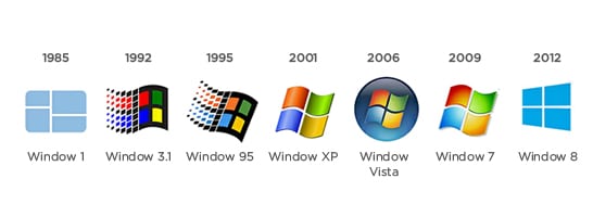
An example of this is the logo changes made by Microsoft.

While mobile responsiveness isn’t the only aspect to your digital presence, it is increasingly important. If you need help to determine how your logo can work in this evolving mobile world, contact your local brand agency Liquid Creativity to learn more.