
BRANDING | POSTED ON 19.08.2019
Colour Psychology: Outstanding Uses of Colour in Branding
Colour is the first thing you take in as a consumer. As a business, the colour of your branding defines you. It makes people feel a certain way, and it becomes your identity. When creating a logo, website or general brand, it’s crucial to get the colour right. It is not as simple as picking a colour scheme you like; there are so many different aspects to consider.

Why is colour important?
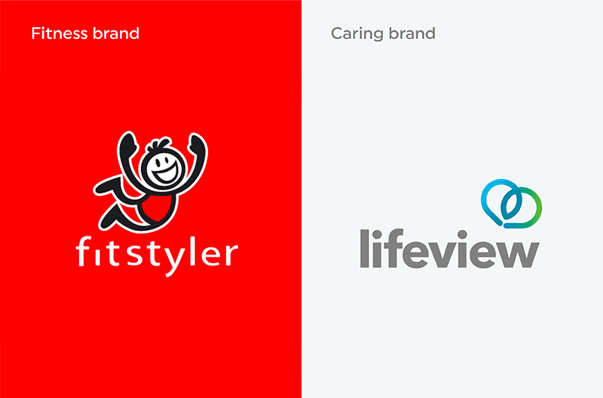
Firstly, you need to be sure you’re sending the right message. If your brand is promoting exercise, you don’t want to be emanating calm and quiet vibes. You want to choose vibrant and energetic colours. Similarly, if you’re a charity or aged care company, you want to be choosing caring and calm colours. It comes as no surprise that colours like red are not considered soothing.
Secondly, the colour really can affect the way people feel. Colour psychology is the study of how colours can impact our psychological wellbeing. For example, one psychological study found that the colour red made people feel bad. It found participants shown the colour red before an IQ test performed worse than the control. This effect takes place outside of the participant’s conscious awareness.
Another study found that when hockey teams wore black, the referee saw them as aggressive. Therefore more likely to receive penalties. So, it’s essential to pay attention to the colours.
Finally, think about all the brands you associate with colours. Coco-Cola has taken ownership of red. Facebook is a distinctive blue, and McDonald’s has the signature yellow in its design. The fact that they are able to take ownership of colour for their brand is impressive. This is the kind of brand power you want.
Did you know that blue is the most popular colour among brands? But what do the colours mean?
The meaning of branding colours

Blue
The colour blue can be trustworthy and strong. This is the impression it gives people. If you want your brand to represent reliability and sturdiness, perhaps blue is the colour for you. It can also be loyalty and confidence.
Not only this, but blues make you feel calm. It’s often associated with water or the sky. There is a reason why social media platforms such as Facebook, Twitter and LinkedIn are all blue.
In addition to this, it’s a colour most universally appreciated. Lots of brands use blue. Banks and businesses will often use blue to attract customers. Lots of computer companies also use blue. It’s seen as trustworthy and keeps people feeling calm and secure.
![]()
Red
Reds can represent love, passion and energy. Any brand that uses red wants to be bold. It’s an eye-catching colour. There is a theory that red increases your heart rate and in turn, makes you hungry. This is why food brands like Mc Donald’s, KFC and Pizza Hut all use red.
However, it can make people feel angry or in danger. But also adventurous. Sports brands like Puma and, for a while, Nike used red to promote passion and adventure. Car companies will use red to seem bold and make people feel powerful.
![]()
Purple
Purple mixes calm blue with passionate red to make a colour that seems mysterious and sensual. For example, Milka and Cadbury’s want you to feel pampered and special eating their chocolate.
It also represents royalty and femininity. Purple might be good for feminine hygiene products, for example.
![]()


Green
Green feels natural and vigorous! It is often associated with nature and environmental products or services. For example, The Body Shop, Subway, and Starbucks use green to seem fresh, natural and healthy. Environmental companies, such as recycling businesses will often use green to represent nature and environmental health.
It can also be wealth – like the colour of money. Skoda, Land Rover and John Deer are all green and have a wealthy target audience.
![]()
Pink
Pink is a caring colour. More often than not associated with, but not exclusively to, young females. For example, Barbie is pink and attracts younger children. Similarly, Cosmopolitan magazine is almost exclusively marketed towards women and has a pink logo.
It’s also romantic and exciting. Like red, pink can have a sensual element. For example, Victoria’s Secret use pink in their branding. So much so that they even have their own sub-brand of Victoria’s Secret PINK.
![]()
Orange
Orange tends to make people feel youthful and creative. For example, Orange (the phone company) provides cheap deals for teenagers. Fanta presents itself as a fun drink for young people. Nickelodeon, a famous TV channel for children, also uses orange. In addition to this, Sound Cloud combines both modern minds and creativity. Therefore, if you want to appeal to young people, orange might work for your brand.
Yellow
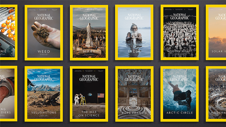
Yellow can be optimism. It’s generally seen as a cheerful, happy colour. For example, IKEA, Warner Brothers, Nikon and National Geographic all use yellow to draw people in and seem friendly. Yellows can also be interpreted as influencing you to pay attention. Warning signs and information posters have yellow backgrounds. Therefore, brands using yellow might be trying to catch your eye.
Black, White and Grey
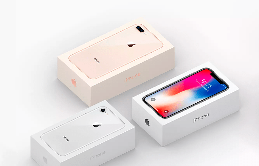
Black is very sophisticated and formal. You tend to get brands that use black with other colours, or it outlines words and images. White is similar. However, it reflects cleanliness and minimalism. Together they can make very minimalist but bold and professional logos. For example, Apple uses these colours on their products to make them look clean and modern and to make their logo and products stand out on the packaging. Adidas also uses a back logo on a white background as it’s an easy colour to put on clothing material.
Multiple colours
Using multiple colours creates their own messages and feelings to attract the right audience. Often brands will have a primary colour and then have a palette of secondary colours they use to differentiate sectors within their market or use them to highlight different points. You still want people to remember the primary colour or colours when they think of your brand.
Choosing the right colour for your branding
You need to pick a colour that will become the face of your brand. It can’t be your favourite colour or one you will change every six months. Not only this, but don’t just choose a colour because other brands have done well using it. It’s got to be yours! It needs to reflect the values of your brand, your brand personality and how you want to be perceived by your target audience. It is better to use a different brand colour than your competitors to make sure you don’t get confused with another business in your market. Own the colour and be associated with a specific colour and shade. Ensure the colour is also consistent across all mediums. Not only use it in your logo but across your brand, in icons, backgrounds and graphics.
Remember, a 17-year-old boy who loves gaming isn’t going to interpret colours the same way as a grandma who loves her garden, so think about the audience carefully when choosing your colours.
Do you still have questions about what colour you should use for your brand? Contact us today for more advice. We can work with you to find the perfect logo and brand colours. In addition, we will help you to develop a style guide so your colours are consistent across your whole branding campaign to get the perfect foundations for your business.


Related Posts
 https://liquidcreativity.com.au/wp-content/uploads/2019/09/sync-branding-marketing.png
472
872
Liquid Designers
https://liquidcreativity.com.au/wp-content/uploads/2016/03/liquid_logo.svg
Liquid Designers2019-09-09 09:27:202023-07-19 02:44:17Why Branding is Important in Marketing
https://liquidcreativity.com.au/wp-content/uploads/2019/09/sync-branding-marketing.png
472
872
Liquid Designers
https://liquidcreativity.com.au/wp-content/uploads/2016/03/liquid_logo.svg
Liquid Designers2019-09-09 09:27:202023-07-19 02:44:17Why Branding is Important in Marketing https://liquidcreativity.com.au/wp-content/uploads/2018/08/Brand_Visual_Language.png
471
871
Liquid Designers
https://liquidcreativity.com.au/wp-content/uploads/2016/03/liquid_logo.svg
Liquid Designers2018-08-22 09:49:422023-07-19 02:58:31Your Business Needs a Brand Visual Language
https://liquidcreativity.com.au/wp-content/uploads/2018/08/Brand_Visual_Language.png
471
871
Liquid Designers
https://liquidcreativity.com.au/wp-content/uploads/2016/03/liquid_logo.svg
Liquid Designers2018-08-22 09:49:422023-07-19 02:58:31Your Business Needs a Brand Visual Language https://liquidcreativity.com.au/wp-content/uploads/2018/07/Design_led_businesses_succeed.png
471
871
Liquid Designers
https://liquidcreativity.com.au/wp-content/uploads/2016/03/liquid_logo.svg
Liquid Designers2018-07-18 09:07:402023-07-19 02:58:37Why Good Design is Crucial For Your Business
https://liquidcreativity.com.au/wp-content/uploads/2018/07/Design_led_businesses_succeed.png
471
871
Liquid Designers
https://liquidcreativity.com.au/wp-content/uploads/2016/03/liquid_logo.svg
Liquid Designers2018-07-18 09:07:402023-07-19 02:58:37Why Good Design is Crucial For Your Business