REBRAND | POSTED ON 07.08.2014
Farmers Insurance Rebrands to Fit a New Era
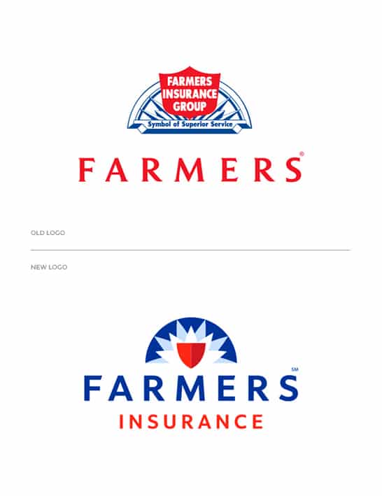
Established in 1928, Farmers Insurance Group is one of the leading insurer groups of vehicles, homes, and small businesses in the United States along with a range of other insurance and financial services products. Recently they have updated their dated logo and the new one reflects an evolutionary rebrand strategy while maintaining the rays, shield, and color palette. A sunrise suggests the optimism of a new day, the sun’s rays represent the broad range of services and strong network of agents, and the shield symbolizes protection. The new identity also replaces the old semi-serif with a bold sans serif typography that fits nicely with the new logo.
“Our new logo is meant to be evolutionary rather than revolutionary,” said Mike Linton, Chief Marketing Officer for Farmers, before pointing another critical reason to refresh their brand. “To distinguish yourself in today’s saturated insurance marketplace, it’s critical that our logo stands out on television, the Web, mobile devices and other media – considerations no one could have imagined in the 1950’s when the Farmers logo was last updated.”
Along with the rebranding, Farmers also released a series of humorous “15 seconds of smart” TV spots featuring J.K Simmons as Professor Nathaniel Burke. The ads follow a pretty simple formula where Burke teaches potential Farmer agents/customers as they walk through various disastrous scenes.


Leave a Reply
Your email address will not be published