As we start a new year, the annual predictions about what to expect in the year ahead from design and branding media websites all come rushing out. We scoured the internet for the predictions that we think will come into fruition and hope it inspires you in your brand identity and logo designs for your brand in 2020.
1. More typography and the return of the serif
Typography, the fundamental design element that you are seeing right now as you read this sentence – or the more widely used term of fonts – will continue to be an important part of brand identities.
More and more brands are deciding to not have graphics and imagery in their brand identity and instead choosing custom type to express their brand values through.
In other news on the font front, 2018 will see the return of serifs as brands start to rediscover their beauty and use in the digital sphere. Expect more modified and customised fonts that blend the modern and traditional to create their own unique look and stand out.
____

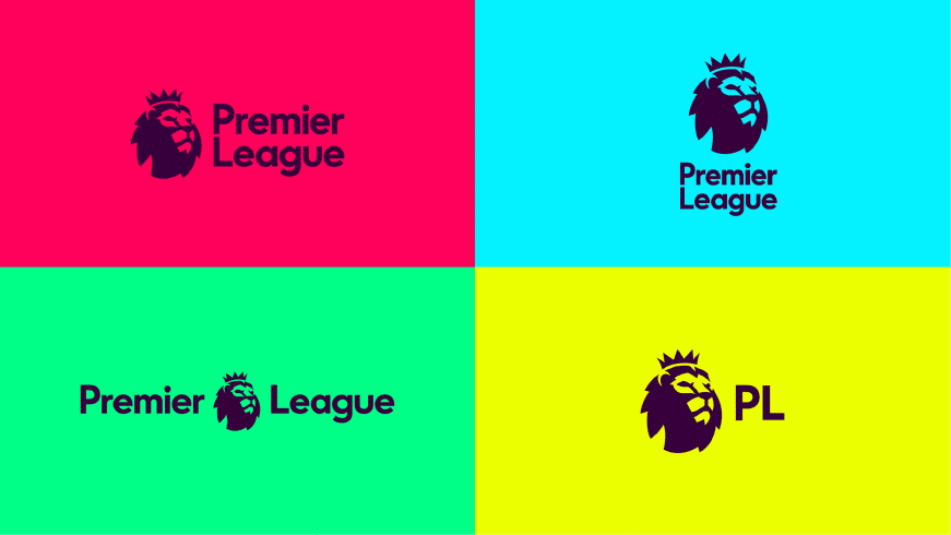
The English Premier League’s brand identity is able to adapt and change to suit the size and space it needs to be in without losing the essence of the branding.
3. Responsive logos
The most frequently mentioned trend in design and branding websites this year is the rise of the responsive logo – a brand identity that can be applied across a number of platforms. It makes sense that this trend is becoming more and more popular as the future progresses towards a mobile and digital future.
Brands have come to realise that their logo, just like their websites need to be legible and recognisable on a myriad of platforms from their packaging to the small, round profile picture on social media.
3. Moving away from flat design and rediscovering form
You don’t have to be a designer to see that flat shapes and simple colours have been in vogue in brand and logo design the past couple of years.
While we doubt we will return to the abstract and blobby 3D shapes that used to be popular in logo design, 2018 will see a blending of the flat with dimensions, including drop shadows and gradients.
As augmented and virtual reality rends rises in popularity more brands will be thinking about their use of space seriously – online and in print. Big brands have begun to think about how they can present themselves to and wow a market that is now more educated about the digital world.
____

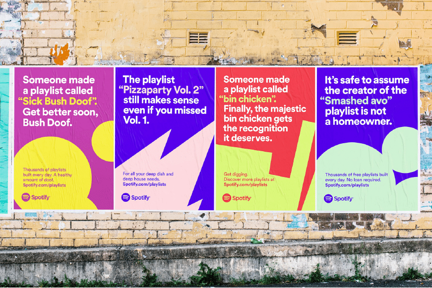
Spotify is one of the brands to use bold colours in their branding and marketing campaigns recently.
4. Bright colours and gradients
The shift from pastels to bright bold colours is already underway as brands continue to experiment with new colour combinations that pop in a platform filled with so many distractions.
These striking colours are being used in all sorts of marketing materials and branding such as the identity of the iPhone X which uses bold colour gradients. Instagram and Spotify have already adapted to this trend in their brand identity creation and more brands – particularly tech and youth-focused businesses – will be using brighter colours this year.
____
Take trends with a grain of salt
Like with shoulder pads, grunge and Gangnam Style, trends come and go so always be weary of being too fashionable. Companies that morph and change with every new design fad don’t have the longevity and loyalty that established brands have.
While it’s always good to know what is going on in the world today, the best brands stick to the best brand design principles and are underpinned by values and a strong strategy. They evolve by taking on the best of contemporary brand thinking and adapt to the times and their audience’s needs. These are the brands which will outlast the fashion of the seasons and live well into the future.
If you’d like to learn more about how to make your brand a classic and outlast the volatile trends of today, contact us and let brand agency Liquid Creativity help your brand live forever.