BRANDING
How To Create A Memorable Brand Logo: Tips And Tricks
Your brand logo is one of the most important elements of your brand identity. It’s the visual snapshot and representation of your brand’s personality, values and message.
It’s often the first thing potential customers see when they encounter your brand, and it’s often the thing they remember about you.
Creating a memorable brand logo isn’t a simple process. It takes creativity, strategy and research. You want your logo to stand out from the competition, resonate with your target audience and reflect your brand’s essence. Randomly choosing a symbol, your favourite colours and plonking it alongside your brand name isn’t going to achieve that.
In this article, we’ll share some tips and tricks on creating a memorable brand logo that will help you grow your business and build customer loyalty. We’ll cover the following topics:
- Designing a brand logo that stands out
- What makes a great logo
- The psychology of logo design
- Creating a memorable logo
- Tips and tricks for a memorable logo
- Finalising your brand logo
Designing a brand logo that stands out
Before you start designing your brand logo, you need to understand the purpose of your logo and how it fits into your overall brand strategy. A logo is not just there to look nice. It’s a powerful communication tool that needs to convey a lot of information about your brand at a glance.
To design a brand logo that stands out, you need to consider the following factors:
- The competition: Research your competitors and see what kind of logos they have. What are their strengths and weaknesses? What are their unique selling points? How can you differentiate yourself from them?
- Your target audience: Work out your ideal customers and what they want from your brand. What are their needs, preferences, and expectations? How can you appeal to their emotions and values?
- Your brand personality: Establish the style of your brand. How do you want your customers to perceive you? What are the core attributes and characteristics of your brand? How can you express them visually?
Memorable logo design: What makes a great brand logo?
A great logo is memorable, effective and suitable for your brand. It should capture your customers’ attention and make a lasting impression on them. It should also communicate your brand’s message clearly and consistently across different platforms and contexts.
To achieve these goals, a great logo should have the following characteristics:
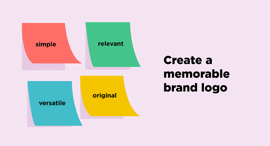
- Simplicity: A simple logo is easy to recognise, remember and reproduce. It can also look more professional and elegant than a complex one. To achieve a simple logo, use minimal elements, colours and fonts that work well together.
- Relevance: A relevant logo relates to your brand’s name, industry, products or services. It should also reflect your brand’s personality and values. Use meaningful symbols, shapes or words that convey your brand’s essence.
- Originality: An original logo is unique and distinctive compared with other logos in your market. It is creative and innovative, which shows that your brand is different and ahead of the curve. Use unexpected or clever elements in your logo that surprise or delight your customers.
- Versatility: A versatile logo works well in different sizes, colours, backgrounds and mediums. It adapts to different situations and audiences. A versatile logo should have a clear, consistent design that can be easily modified or scaled without losing its quality or identity.
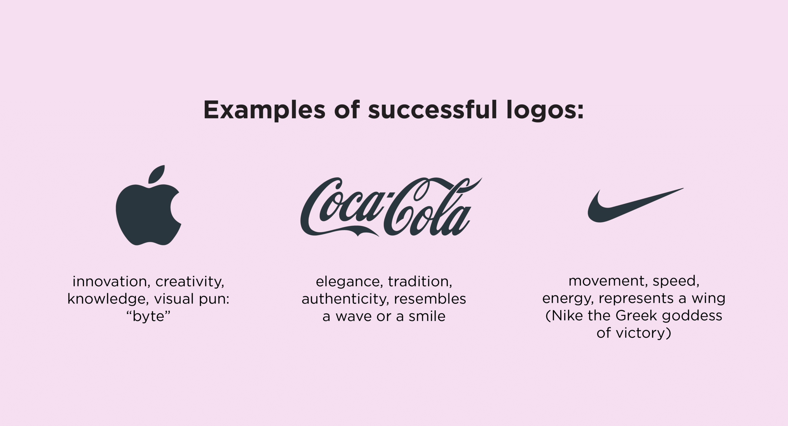
Some examples of successful logos that have these characteristics are:
Apple: The Apple logo is one of the most iconic logos. The bitten apple symbolises innovation, creativity and knowledge. It also creates a visual pun on the word “byte”, which relates to computers and technology.
Nike: The Nike logo is another example of a simple, relevant, original, versatile logo. The swoosh represents movement, speed and energy. It also suggests a wing, which relates to the Greek goddess of victory, Nike.
Coca-Cola: The Coca-Cola logo is one of the most recognisable logos in the world. The script font conveys elegance, tradition and authenticity. It also creates a distinctive shape that resembles a wave or a smile.
The psychology of logo design
The psychology of logo design studies how people perceive logos and how they affect their emotions and behaviour. It looks at how colours, shapes, fonts and other design elements can influence customers’ attitudes and decisions.
What should I consider when choosing colours for my brand logo?
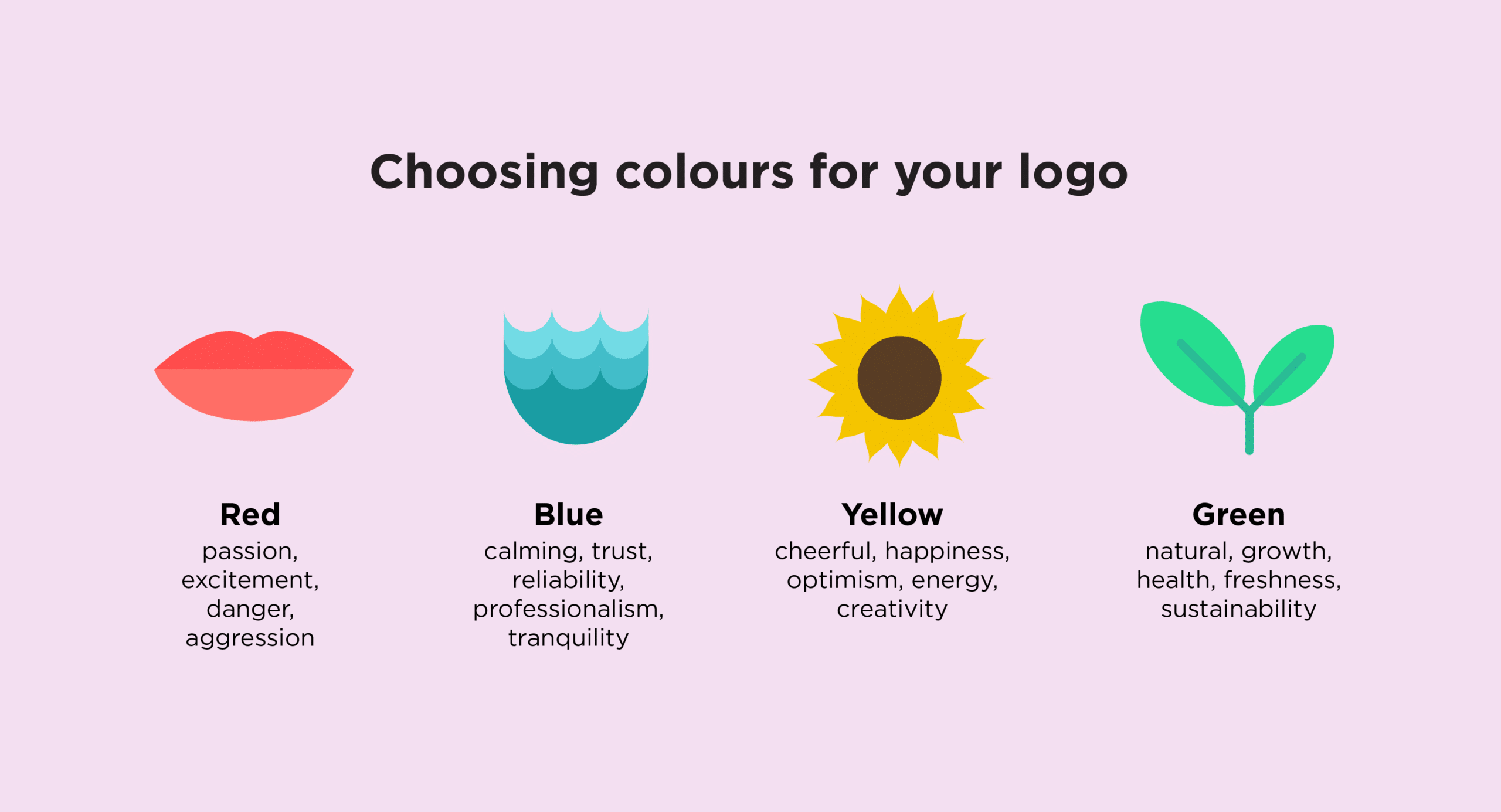
One of the most important aspects of logo design psychology is colour theory. Colours have different meanings and associations in different cultures and contexts. They can also evoke different moods and feelings in people. For example:
- Red: a powerful colour that can signify passion, excitement, danger or aggression. It can also stimulate appetite and attention.
- Blue: a calming colour that can signify trust, reliability, professionalism or tranquility. It can also reduce stress and promote loyalty.
- Yellow: a cheerful colour that can signify happiness, optimism, energy, or creativity. It can also stimulate curiosity and enthusiasm.
- Green: a natural colour that can signify growth, health, freshness or sustainability. It can also encourage relaxation and harmony.
What role does typography play in a brand logo?
Another important aspect of logo design psychology is typography. Typography is all about making written language look good and easy to read. It’s an art form that involves arranging different styles of type for visual effect. Typography can convey meaning and emotion through fonts, sizes, styles and spacing. For example:
- Serif fonts: fonts with small strokes or lines attached to the end of the main strokes of the letters. They are often used for traditional, formal, or elegant brands. Examples of serif fonts are:
- Times New Roman
- Georgia
- Garamond
- Sans serif fonts: fonts that do not have serifs. They are often used for modern, clean, or minimalist brands. Examples of sans serif fonts are:
- Arial
- Helvetica
- Verdana
- Script fonts: fonts that mimic handwriting or calligraphy. They are often used for creative, artistic or whimsical brands. Examples of script fonts are:
- Brush Script
- Lucida Handwriting
- Pacifico
How to create a memorable logo
Once you clearly understand your brand’s purpose, audience, personality and message, you can start creating your logo.
Here are some steps to follow:
- Sketching and brainstorming: You can use paper and pencil, digital tools or online logo makers to generate various concepts. You can also use inspiration from other logos, images, words or symbols related to your brand.
- Choosing the right design elements: Decide on the type of logo you want (e.g., wordmark, letter mark, pictorial mark, abstract mark, mascot), the colours you want to use (e.g., monochrome, complementary, analogous), the typography you want to use (e.g., serif, sans serif, script), and the shape you want to use (e.g., circle, square, triangle).
- Iterating and refining the design: Keep working on your design until you’re happy with the result. You need to test your logo in different sizes, colours, backgrounds, and mediums to see how it looks and works and get feedback from your target customers to see how they perceive and respond to it.
Finalising your brand logo
Once you have created a logo that resonates with your audience and reflects your business, you need to finalise it and make it ready for use. Here are some steps to follow:
- Get stakeholder feedback: Check with your partners, employees and investors to see if they approve of your logo and if it aligns with your brand’s vision and goals.
- Make necessary adjustments: Update your logo based on the feedback you received. You may need to tweak some colours, fonts, shapes or other elements to improve your logo’s appearance or performance.
- Create a brand style guide: Document the rules and guidelines for using your logo. A brand style guide should include information such as the logo’s variations, sizes, colours, fonts, spacing, alignment and dos and don’ts.
Common mistakes in logo design
Some common mistakes to avoid when designing a brand logo are:
- Using clipart or stock images: Clipart or stock images are generic and unoriginal. They can make your logo look cheap and amateurish. They can also cause legal issues if you don’t have the proper license or permission to use them. You should create your own logo from scratch or use a professional.
- Using too many colours or fonts: Too many colours or fonts can make your logo look cluttered and chaotic. They can also reduce the legibility and readability of your logo. You should limit your logo to two or three colours and fonts that complement each other and match your brand personality.
- Following trends too closely: Trends can be tempting, but they can become outdated or clichéd over time. They can also make your logo look like other logos in your market and not stand out. You should avoid copying or imitating other popular logos and try to create a timeless and unique logo that reflects your brand’s essence.
- Ignoring the context: The context is the environment where your logo will be seen and used. It includes the size, background, medium and audience of your logo. You should consider how your logo looks and works in different contexts and make sure it is versatile and adaptable.
- Not testing your logo: Testing your logo is an important step in the design process. It helps you to evaluate how your potential customers perceive, react, and respond to your logo. It also allows you to identify any issues or problems with your logo before you launch it. You should test your logo with different methods, such as surveys, polls, focus groups or online tools.
Logo design: How to get it right
Logo design is a specialised skill, and while there are tools to help novices do it themselves, we recommend seeking expert support.
Your logo can make a huge difference to your business success, and it’s tricky to create one that captures your brand essence, communicates your brand’s message, is simple, relevant, original and versatile, and makes a lasting impression.
At Liquid Creativity, we believe logo creation sits within a strategic brand design process. Contact us today if you’re ready to elevate your business with a memorable logo. We’d love to hear from you and help you with your brand strategy and logo design needs.
FAQs
What is a brand naming mistake?
A brand naming mistake is an error or flaw that affects the quality, effectiveness or suitability of your brand name. It can hurt your brand’s image, reputation or recognition. It can also make it harder for your customers to find, remember or trust your brand.
How does using a generic name hurt my brand?
Using a generic name hurts your brand because it makes your brand boring and forgettable. It doesn’t tell your customers anything unique or distinctive about your brand. It also makes it harder for your brand to stand out from competitors and rank well on search engines.
What are some common mistakes when using geographic locations in a brand name?
Some common mistakes when using geographic locations in a brand name are:
- Using a location that is too broad or vague (e.g., “Global Solutions”, “Worldwide Travel”)
- Using a location that is too narrow or specific (e.g., “Swan Street Plumbing”, “Rose Bay Accounting”)
- Using a location that is irrelevant or misleading (e.g., “New York Pizza”, “Paris Fashion”)
These mistakes can limit your brand’s scope, potential, or growth. They can also confuse or alienate your customers who are not from or familiar with the location.
What are some key factors to consider when creating a brand name?
Some key factors to consider when creating a brand name are:
- Your brand strategy defines your goals, values, personality, and positioning. Your brand name should reflect and support your brand strategy.
- Your target audience is the group of people who are most likely to buy or use your products or services. Your brand name should resonate and connect with your target audience.
- Your competitors are the other businesses that offer similar products or services as yours. Your brand name should differentiate and distinguish your brand from your competitors.
- Your industry is the category or sector that your business belongs to. Your brand name should be relevant and suitable for your industry.
- Your culture is the set of beliefs, values, norms, and customs that influence your business. Your brand name should be respectful and appropriate for your culture.
- Your SEO improves the visibility and ranking of your website on search engines. Your brand name should be optimised and keyword-rich for search engines.
