
PACKAGING | POSTED ON 11.07.2014
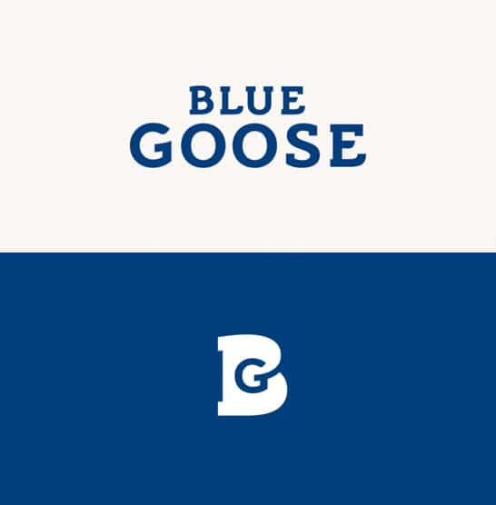
Blue Goose new packaging is naturally good
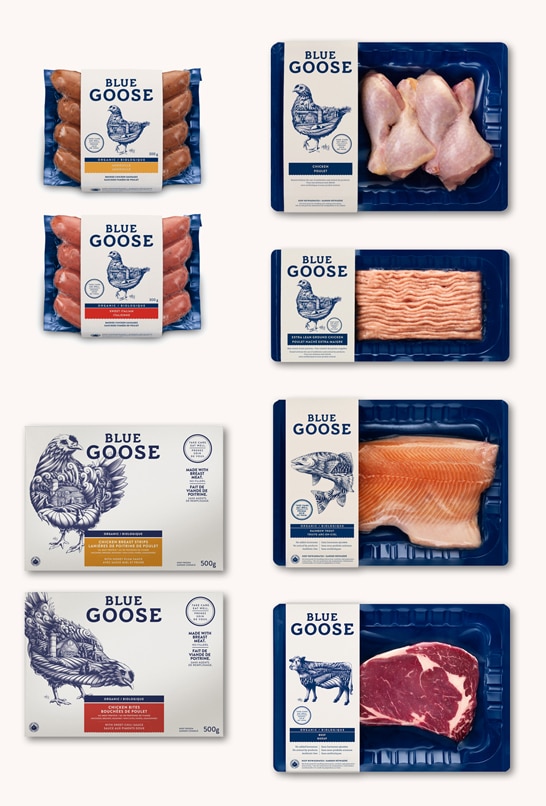
Established in 1992 in Vancouver, Canada, Blue Goose is an organic/natural food brand, whose philosophy is if you look after your land and animals, they will look after you. Blue Goose (originally named Blue Goose Cattle Company) now produces organic and natural beef, chicken and fish for the Canadian market, so they went through a rebranding process to reflect this change both in their new packaging design and brand identity.
The new logotype is a nice stand-alone visual that works best when paired around all the pretty typographic treatments, starting with the main “Blue Goose” wordmark that has a nice bounce to it with the curved bottom right corners.
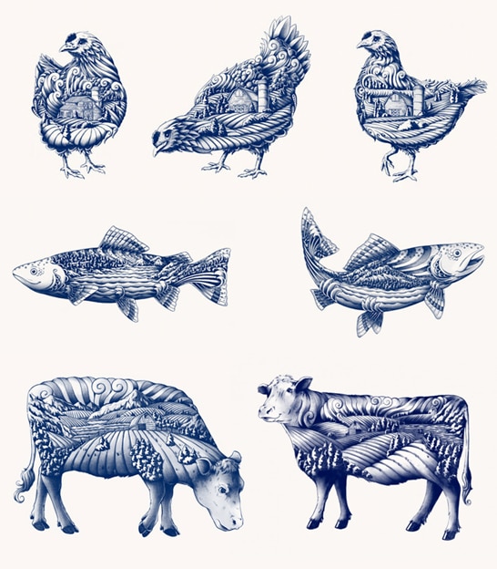
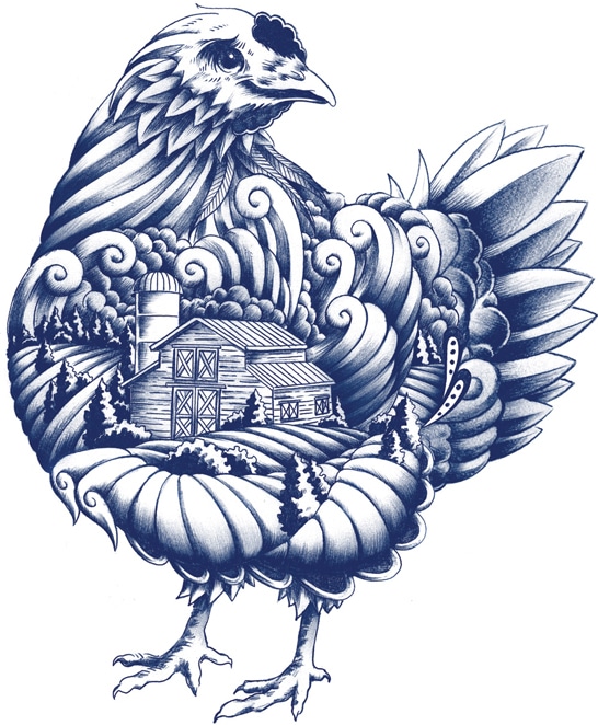
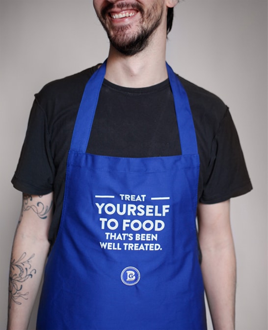
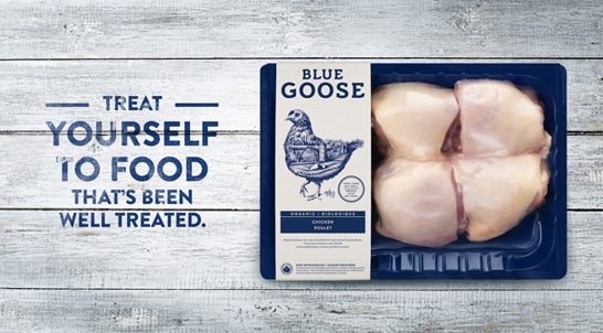
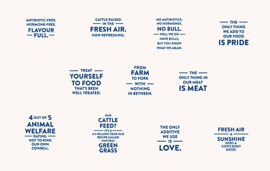
Another great aspect of the new packaging design and identity is of course Ben Kwok’s beautiful animal illustrations. Highly detailed and rendered, each image unfolds into serene scenes that represent the animal’s natural habitat, clearly establishing Blue Goose as a source of highly crafted products. Blue Goose rely almost exclusively on its packaging to sell itself, promoting its ethical treatment of animals with the slogan “Take care, eat well”.
 https://liquidcreativity.com.au/wp-content/uploads/2016/02/mova_icecream01.jpg
471
871
Liquid Designers
https://liquidcreativity.com.au/wp-content/uploads/2016/03/liquid_logo.svg
Liquid Designers2014-08-26 14:50:162022-10-20 18:07:27US Market – Meet our Clean Packaging Design
https://liquidcreativity.com.au/wp-content/uploads/2016/02/mova_icecream01.jpg
471
871
Liquid Designers
https://liquidcreativity.com.au/wp-content/uploads/2016/03/liquid_logo.svg
Liquid Designers2014-08-26 14:50:162022-10-20 18:07:27US Market – Meet our Clean Packaging Design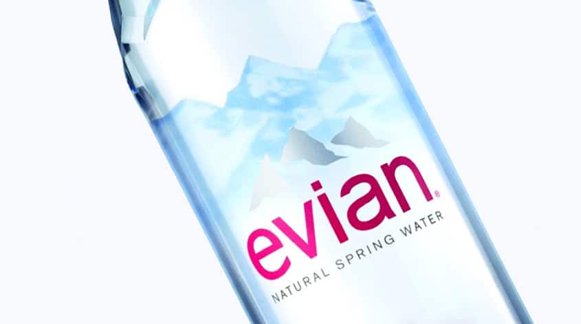 https://liquidcreativity.com.au/wp-content/uploads/2016/02/evian_01.jpg
471
871
Liquid Designers
https://liquidcreativity.com.au/wp-content/uploads/2016/03/liquid_logo.svg
Liquid Designers2014-08-11 09:21:482022-10-20 19:37:24New Evian Bottle Design is Sleek and Clean
https://liquidcreativity.com.au/wp-content/uploads/2016/02/evian_01.jpg
471
871
Liquid Designers
https://liquidcreativity.com.au/wp-content/uploads/2016/03/liquid_logo.svg
Liquid Designers2014-08-11 09:21:482022-10-20 19:37:24New Evian Bottle Design is Sleek and Clean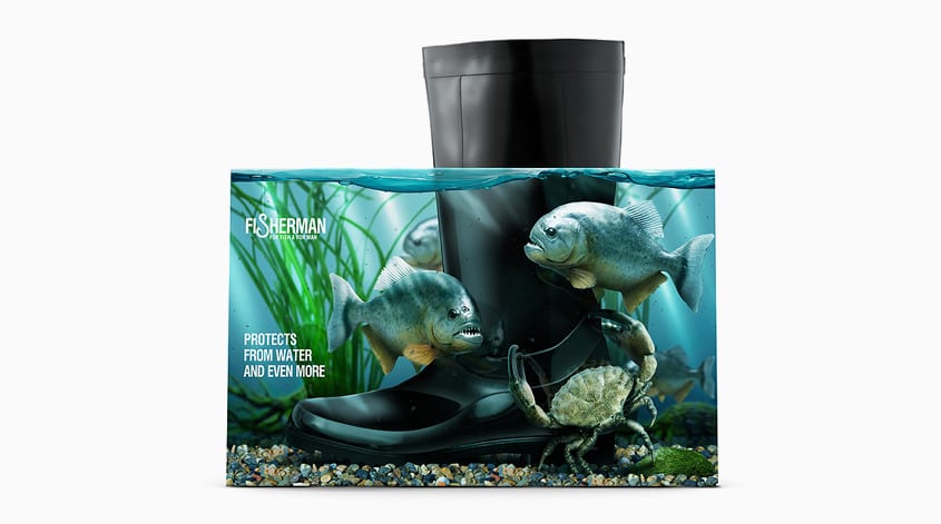 https://liquidcreativity.com.au/wp-content/uploads/2016/02/fisherman_01.jpg
471
871
Liquid Designers
https://liquidcreativity.com.au/wp-content/uploads/2016/03/liquid_logo.svg
Liquid Designers2014-07-07 16:18:552022-10-20 22:12:55These Boots Are Made For Walking (On Water)
https://liquidcreativity.com.au/wp-content/uploads/2016/02/fisherman_01.jpg
471
871
Liquid Designers
https://liquidcreativity.com.au/wp-content/uploads/2016/03/liquid_logo.svg
Liquid Designers2014-07-07 16:18:552022-10-20 22:12:55These Boots Are Made For Walking (On Water)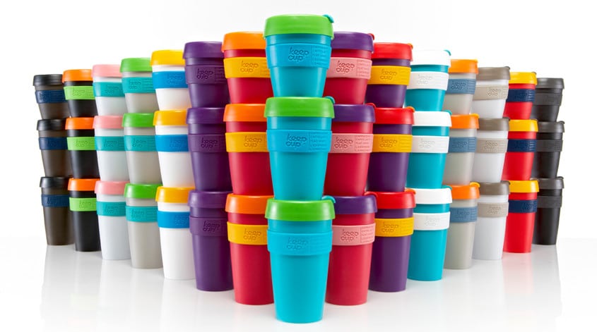 https://liquidcreativity.com.au/wp-content/uploads/2016/02/keepcup_01.jpg
471
871
Liquid Designers
https://liquidcreativity.com.au/wp-content/uploads/2016/03/liquid_logo.svg
Liquid Designers2014-07-01 11:01:062021-10-25 17:55:03A Brand Strategy to Keep(Cup) – Branding Strategies to Grow Your Business
https://liquidcreativity.com.au/wp-content/uploads/2016/02/keepcup_01.jpg
471
871
Liquid Designers
https://liquidcreativity.com.au/wp-content/uploads/2016/03/liquid_logo.svg
Liquid Designers2014-07-01 11:01:062021-10-25 17:55:03A Brand Strategy to Keep(Cup) – Branding Strategies to Grow Your Business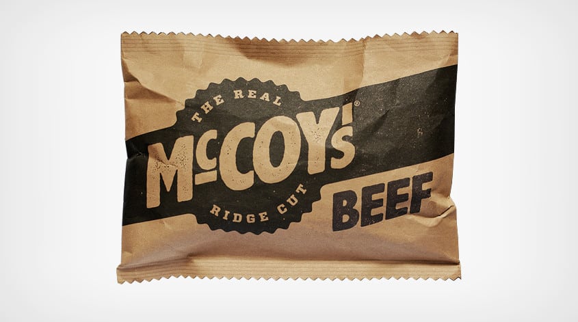 https://liquidcreativity.com.au/wp-content/uploads/2016/02/mccoys01.jpg
471
871
Liquid Designers
https://liquidcreativity.com.au/wp-content/uploads/2016/03/liquid_logo.svg
Liquid Designers2014-06-17 09:27:592022-10-20 22:07:46The Real Man’s Chips
https://liquidcreativity.com.au/wp-content/uploads/2016/02/mccoys01.jpg
471
871
Liquid Designers
https://liquidcreativity.com.au/wp-content/uploads/2016/03/liquid_logo.svg
Liquid Designers2014-06-17 09:27:592022-10-20 22:07:46The Real Man’s Chips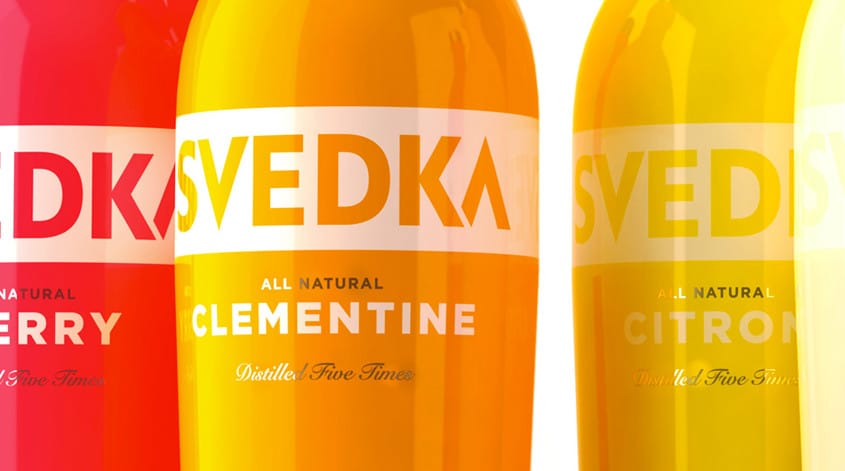 https://liquidcreativity.com.au/wp-content/uploads/2016/02/svedka01.jpg
471
871
Liquid Designers
https://liquidcreativity.com.au/wp-content/uploads/2016/03/liquid_logo.svg
Liquid Designers2014-06-03 09:00:092022-10-20 22:05:31Svedka – Cheers to their New Design!
https://liquidcreativity.com.au/wp-content/uploads/2016/02/svedka01.jpg
471
871
Liquid Designers
https://liquidcreativity.com.au/wp-content/uploads/2016/03/liquid_logo.svg
Liquid Designers2014-06-03 09:00:092022-10-20 22:05:31Svedka – Cheers to their New Design!

Leave a Reply
Your email address will not be published