PACKAGING | POSTED ON 10.05.2013
New Packaging Design Increases Sales for Weis
The first Weis bars were developed by Cyrill Weis in 1936 based on the concept of using natural ingredients, fresh fruits and ice cream. It wasn’t until 1957 that his son Les sold the iconic Fruito bar commercially in Toowoomba Queensland that distribution quickly expanded through the city and interstate making it’s way to becoming a national ice cream brand. Over the decades, the brand has had many packaging designs with the most recent in 2011.
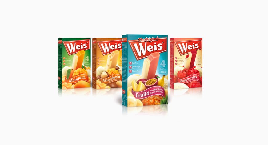
With the ice cream market being extremely competitive, the Weis multipacks needed to have enough visual appeal to be highly noticeable and connect to the target consumers and encourage them to try the product. The repositioning of the brand had to also incorporate the values of the brand and convey these messages clearly and concisely. The packaging designs had to be strong and focused on ‘real fruit and real ingredients’ to stand out amongst the cluttered market and promotional activity of other mainstream brands competing in the same space.
The red Weis logo is more dominant and visible on the new packaging design. This creates stronger brand recognition and recall. An abundance of fresh fruit was used as a visual to highlight the natural ingredients as the key selling point. The packaging uses bold colours for each of the corresponding fruits and reflects the intensity of each distinctive fruity flavour. The use of these colours also increases the visibility of the different varieties available on the shelves.
The result of the redesign has been positive for the growth of the brand development. Sales have increased by 32% with no advertising support.


Good custom packaging helps to market a product and improve sales. About 60% of shoppers who walk into your store are likely to go for attractive custom packages containing your product.