REBRAND | POSTED ON 24.06.2014
Flying High on Customer Satisfaction
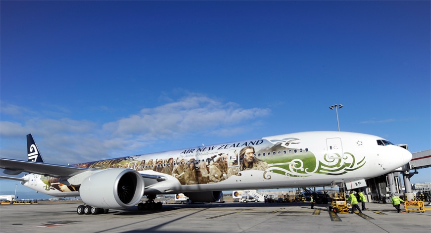
Air New Zealand, the preferred airline of Middle-earth, developed a new brand identity to enhance their brand alignment, competitive advantage and customer satisfaction. As part of their new brand image, Air New Zealand modernised the original typeface, creating credibility and elegance, more in line with their new brand promise of “liberating travelers from the ordinary”. The iconic Kuro symbol remains and is set within their national colour.
One of the challenges Air New Zealand faced was the competitive market. The airline aims to be the choice of customers travelling to, from and within New Zealand. Their brand strategy is to promote their country, culture, people and business at home and overseas. Their competitive advantage is their creative and innovative staff, who add to the growth and energy of the company.
Air New Zealand are well known for their quirky and engaging safety videos. In preparation for the release of Peter Jackson’s The Hobbit: An Unexpected Journey, they released a Middle-earth inspired safety video where elvin crew members are seen instructing hobbits, dwarves, wizards and other creatures on in-flight safety. Peter Jackson delivers an exceptional cameo along with Gollum. Passengers who paid close attention to the safety video and spotted the secret Elvish code had the chance to win a once in a lifetime Middle-earth experience in New Zealand.
The result of the rebranding was rewarding as the airline won numerous global awards for customer experience, safety, sustainable tourism and employer of choice. Passengers regularly referred to the airline’s distinctive personality that shone through for all customers.


Leave a Reply
Your email address will not be published