
REBRAND | POSTED ON 09.05.2014
A Rebrand to Open up Opera Australia
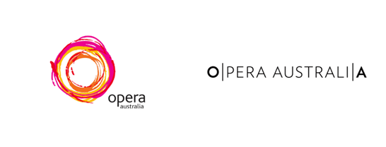
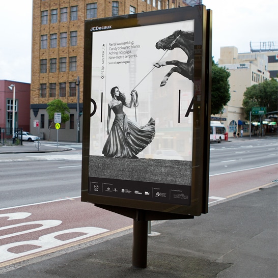
Opera Australia is Australia’s primary opera company and one of the world’s busiest opera companies. Last year, when they launched their 2014 season, a clean and simple rebrand was also part of the show. Their new multi-dimensional brand identity can be summarised as ‘setting opera free’, opening it to wider audience as reflected by the energetic (bracketed) logo that opens up. O|A extends to the full name – Opera Australia, or to a shorter one – Opera. The vertical lines used throughout the applications are inspired by musical notations and a secondary typeface (italic serif) helps soften the identity, making it more charming.

![]()

 https://liquidcreativity.com.au/wp-content/uploads/2020/08/Build_a_great_brand-02b.png
481
881
Liquid Designers
https://liquidcreativity.com.au/wp-content/uploads/2016/03/liquid_logo.svg
Liquid Designers2020-08-20 15:44:382023-07-19 02:46:11How to build a great brand that’s aligned with your business
https://liquidcreativity.com.au/wp-content/uploads/2020/08/Build_a_great_brand-02b.png
481
881
Liquid Designers
https://liquidcreativity.com.au/wp-content/uploads/2016/03/liquid_logo.svg
Liquid Designers2020-08-20 15:44:382023-07-19 02:46:11How to build a great brand that’s aligned with your business  https://liquidcreativity.com.au/wp-content/uploads/2020/08/Improving_brand_Consistency-scaled.jpg
1384
2560
Liquid Designers
https://liquidcreativity.com.au/wp-content/uploads/2016/03/liquid_logo.svg
Liquid Designers2020-08-02 12:31:232023-07-19 02:45:56What is Brand Consistency & Why Every Business Should Care – Liquid Creativity
https://liquidcreativity.com.au/wp-content/uploads/2020/08/Improving_brand_Consistency-scaled.jpg
1384
2560
Liquid Designers
https://liquidcreativity.com.au/wp-content/uploads/2016/03/liquid_logo.svg
Liquid Designers2020-08-02 12:31:232023-07-19 02:45:56What is Brand Consistency & Why Every Business Should Care – Liquid Creativity https://liquidcreativity.com.au/wp-content/uploads/2020/01/Profiling-brand-personality-1.png
482
882
Liquid Designers
https://liquidcreativity.com.au/wp-content/uploads/2016/03/liquid_logo.svg
Liquid Designers2020-02-26 10:08:172023-07-19 02:45:25Brand Profiling: Building a Consistent Brand With a Compelling Personality
https://liquidcreativity.com.au/wp-content/uploads/2020/01/Profiling-brand-personality-1.png
482
882
Liquid Designers
https://liquidcreativity.com.au/wp-content/uploads/2016/03/liquid_logo.svg
Liquid Designers2020-02-26 10:08:172023-07-19 02:45:25Brand Profiling: Building a Consistent Brand With a Compelling Personality https://liquidcreativity.com.au/wp-content/uploads/2020/01/Project-your-brand-management.png
482
882
Liquid Designers
https://liquidcreativity.com.au/wp-content/uploads/2016/03/liquid_logo.svg
Liquid Designers2020-02-11 09:21:132023-07-19 02:45:11Brand Management: Process and Responsibilities
https://liquidcreativity.com.au/wp-content/uploads/2020/01/Project-your-brand-management.png
482
882
Liquid Designers
https://liquidcreativity.com.au/wp-content/uploads/2016/03/liquid_logo.svg
Liquid Designers2020-02-11 09:21:132023-07-19 02:45:11Brand Management: Process and Responsibilities https://liquidcreativity.com.au/wp-content/uploads/2019/11/Brand-audit-does-your-business-need-a-brand-refresh.png
481
881
Liquid Designers
https://liquidcreativity.com.au/wp-content/uploads/2016/03/liquid_logo.svg
Liquid Designers2019-11-25 10:53:072023-07-19 02:44:36Brand Audit: Does Your Business Need a Brand Refresh?
https://liquidcreativity.com.au/wp-content/uploads/2019/11/Brand-audit-does-your-business-need-a-brand-refresh.png
481
881
Liquid Designers
https://liquidcreativity.com.au/wp-content/uploads/2016/03/liquid_logo.svg
Liquid Designers2019-11-25 10:53:072023-07-19 02:44:36Brand Audit: Does Your Business Need a Brand Refresh? https://liquidcreativity.com.au/wp-content/uploads/2019/09/sync-branding-marketing.png
472
872
Liquid Designers
https://liquidcreativity.com.au/wp-content/uploads/2016/03/liquid_logo.svg
Liquid Designers2019-09-09 09:27:202023-07-19 02:44:17Why Branding is Important in Marketing
https://liquidcreativity.com.au/wp-content/uploads/2019/09/sync-branding-marketing.png
472
872
Liquid Designers
https://liquidcreativity.com.au/wp-content/uploads/2016/03/liquid_logo.svg
Liquid Designers2019-09-09 09:27:202023-07-19 02:44:17Why Branding is Important in Marketing

Leave a Reply
Your email address will not be published