BRAND POSITIONING | POSTED ON 22.05.2019
Unpacking ahm’s New Brand Positioning: The Art Of Simplicity
Health insurer, ahm has been in business since 1971 and have long been known for its focus on affordable health insurance. While amassing over 370,000 members; it was clear ahm had to do more to establish their position in the market. With almost every health insurer promising affordability, it was no longer a niche that could give ahm a winning edge.
Keen to attract a particular market segment and carve out a new brand position in the market, ahm took on a total repositioning, focusing on the art of simplicity.

The repositioning brief
Goal: Differentiate ahm as a simple, easy and affordable health insurance provider.
Focus: Millennials.
Scope: TV, online and print as well as a totally new brand platform.
Objective: Improve unprompted brand awareness.
The repositioning challenge
Working with their brand experts, ahm drew on a wealth of research in order to get their new positioning right the first time. ahm drew on years of internal research collated from their clients and prospects to ensure they were catering for their target market. This research has enabled ahm to have a meticulous and considered approach to their target audience of millennials.
As well as internal research, the project also included semiotic analysis to help ahm to determine exactly what simple looks like. With a focus on reducing the complexities in the health insurance industry, the challenge for the branding team was to strip back the stressors and the frivolities and focus on being simple, but effective.
The result: The Simple Bit
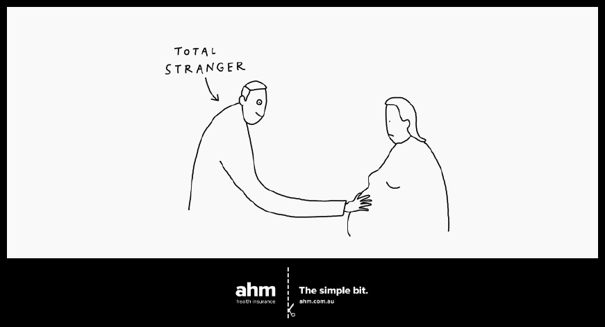
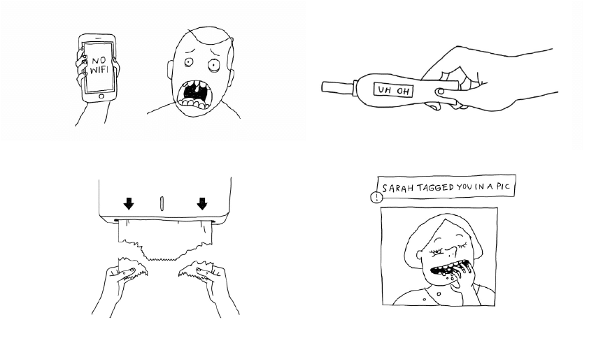
The repositioning campaign focuses on the platform; The Simple Bit. With a relatable, friendly and no-nonsense approach with a slight touch of humour, ahm’s focus stays true to the needs and wants of its millennial customers. With help from New Yorker contributor and illustrator, Liana Finck, simple black and white cartoons catch the eye and deliver a message in one quick glance.
As well as stripping back the complexities of health insurance, ahm’s new positioning went from making the most impact from as little as possible. A no-waste focus meant the whole branding campaign was completely stripped back to show precisely what ahm is; simple, easy and affordable. Anything that didn’t add value was taken away.
The advertising for ahm highlights the daily stressors that Millennials face while shining the spotlight on ahm’s novel and straightforward approach.
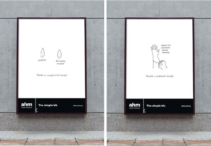
As well as the focus on The Simple Bit, it was important that there was still a focus on affordability. The new brand campaign highlights the core promise of value and how clients can get more for less.
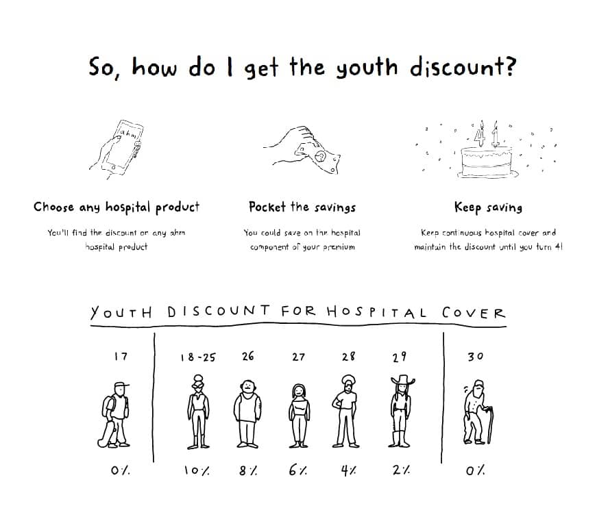
The General Manager of ahm, Jan O’Keefe explains; “We’ve always anchored our messaging around price, but this new brand platform highlights the bold simplicity of our products and customer experience. Our customer base is the youth market, and we know they value simplicity as particularly important”. For its effectiveness, ahm need to ensure their commitment to simplicity throughout their whole platform and continue to grow their brand awareness through striking, yet simple marketing.
