REBRAND | POSTED ON 21.08.2014
NSW Transport is Now a Unified Brand
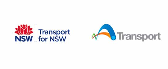
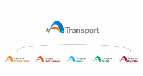
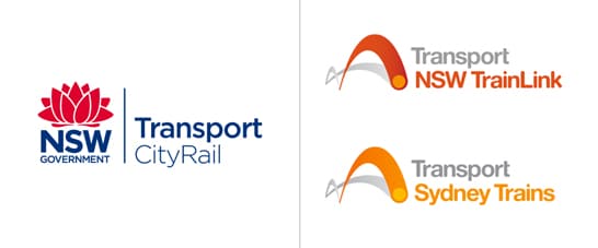
Sydney’s public transport – trains, buses, ferries and light rails – have come together under one unified brand. The new logo, called “The Hop”, depicts a bouncy ball featuring a couple of colourful linking arches and replaces more than a dozen of NSW transport logos. The format is replicated for Sydney’s trains, buses, ferries, light rail and NSW Trainlink with different colours being assigned to each mode of transport.
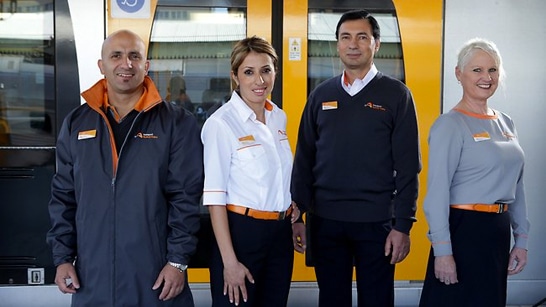
With the logo being progressively rolled out across the various modes of transport, new uniforms for the front line CityRail staff were also introduced – they are now grey and white with orange trims.
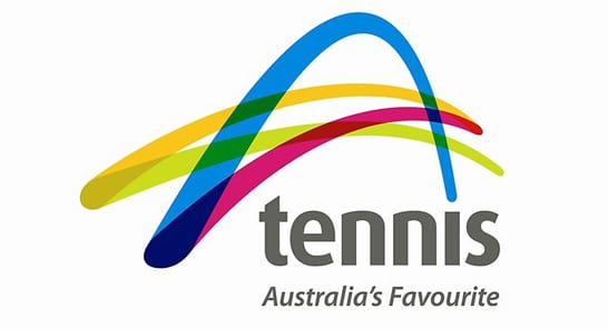
It has been noted though that The Hop strikingly resembles Tennis Australia brand.






Leave a Reply
Your email address will not be published