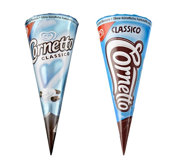
After analysing other popular brands of treats, Cornetto noticed the strong use of typography.
Wanting to ‘own the cone’, the new logotype resembles the shape of the cone with the capital C at the top, narrowing down to the O at the tip. Not only is the new logotype easy to recognise, it also incorporates the Unilever heart into the C.
Each of the flavours have been assigned a colour for easy identification, blue for vanilla, red for strawberry, green for mint and brown for chocolate. With the stronger and more energetic branding, they now stand out in the freezer cabinets.
The Cornetto rebrand was also carried across to their premium Enigma range which has a different look and feel to the classics. Enigma cones have clear plastic lids that reveal the enticing ice cream inside with chocolate swirls.
Along with the rebrand Cornetto adopted a new tag line “Enjoy the ride, love the ending” and launched the Cupidity campaign, featuring four short romantic films targeting their young audience around the world. The films explore different experiences of the teenage romance journey, showing the younger generation that anything is possible in love and encouraging them to “enjoy the ride, love the ending”.

