
REBRAND | POSTED ON 15.08.2013
The Tiger Changed its Stripes and Now Wants to Fly High
Tiger Airways, a low-cost airline has recently undergone a new change. Now known as Tigerair, they have rebranded while creating a joint venture with Virgin. Tigerair wanted to change the way they connect to their customers, to be more ‘warm, passionate and genuine’. The new logo no longer uses the tiger and it consists of only a logotype. It is cute and bubbly with it’s oversize titles which Tigerair says symbolises their role in connecting their customers from one point to another. The orange hanging off the ‘g’ is a reference to a tiger’s tail, cheesy, but playful.
 https://liquidcreativity.com.au/wp-content/uploads/2020/08/Build_a_great_brand-02b.png
481
881
Liquid Designers
https://liquidcreativity.com.au/wp-content/uploads/2016/03/liquid_logo.svg
Liquid Designers2020-08-20 15:44:382023-07-19 02:46:11How to build a great brand that’s aligned with your business
https://liquidcreativity.com.au/wp-content/uploads/2020/08/Build_a_great_brand-02b.png
481
881
Liquid Designers
https://liquidcreativity.com.au/wp-content/uploads/2016/03/liquid_logo.svg
Liquid Designers2020-08-20 15:44:382023-07-19 02:46:11How to build a great brand that’s aligned with your business 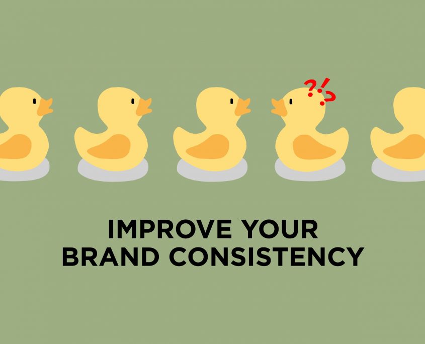 https://liquidcreativity.com.au/wp-content/uploads/2020/08/Improving_brand_Consistency-scaled.jpg
1384
2560
Liquid Designers
https://liquidcreativity.com.au/wp-content/uploads/2016/03/liquid_logo.svg
Liquid Designers2020-08-02 12:31:232023-07-19 02:45:56What is Brand Consistency & Why Every Business Should Care – Liquid Creativity
https://liquidcreativity.com.au/wp-content/uploads/2020/08/Improving_brand_Consistency-scaled.jpg
1384
2560
Liquid Designers
https://liquidcreativity.com.au/wp-content/uploads/2016/03/liquid_logo.svg
Liquid Designers2020-08-02 12:31:232023-07-19 02:45:56What is Brand Consistency & Why Every Business Should Care – Liquid Creativity https://liquidcreativity.com.au/wp-content/uploads/2020/01/Profiling-brand-personality-1.png
482
882
Liquid Designers
https://liquidcreativity.com.au/wp-content/uploads/2016/03/liquid_logo.svg
Liquid Designers2020-02-26 10:08:172023-07-19 02:45:25Brand Profiling: Building a Consistent Brand With a Compelling Personality
https://liquidcreativity.com.au/wp-content/uploads/2020/01/Profiling-brand-personality-1.png
482
882
Liquid Designers
https://liquidcreativity.com.au/wp-content/uploads/2016/03/liquid_logo.svg
Liquid Designers2020-02-26 10:08:172023-07-19 02:45:25Brand Profiling: Building a Consistent Brand With a Compelling Personality https://liquidcreativity.com.au/wp-content/uploads/2020/01/Project-your-brand-management.png
482
882
Liquid Designers
https://liquidcreativity.com.au/wp-content/uploads/2016/03/liquid_logo.svg
Liquid Designers2020-02-11 09:21:132023-07-19 02:45:11Brand Management: Process and Responsibilities
https://liquidcreativity.com.au/wp-content/uploads/2020/01/Project-your-brand-management.png
482
882
Liquid Designers
https://liquidcreativity.com.au/wp-content/uploads/2016/03/liquid_logo.svg
Liquid Designers2020-02-11 09:21:132023-07-19 02:45:11Brand Management: Process and Responsibilities https://liquidcreativity.com.au/wp-content/uploads/2019/11/Brand-audit-does-your-business-need-a-brand-refresh.png
481
881
Liquid Designers
https://liquidcreativity.com.au/wp-content/uploads/2016/03/liquid_logo.svg
Liquid Designers2019-11-25 10:53:072023-07-19 02:44:36Brand Audit: Does Your Business Need a Brand Refresh?
https://liquidcreativity.com.au/wp-content/uploads/2019/11/Brand-audit-does-your-business-need-a-brand-refresh.png
481
881
Liquid Designers
https://liquidcreativity.com.au/wp-content/uploads/2016/03/liquid_logo.svg
Liquid Designers2019-11-25 10:53:072023-07-19 02:44:36Brand Audit: Does Your Business Need a Brand Refresh?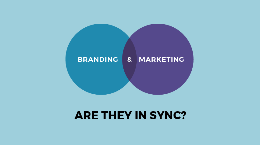 https://liquidcreativity.com.au/wp-content/uploads/2019/09/sync-branding-marketing.png
472
872
Liquid Designers
https://liquidcreativity.com.au/wp-content/uploads/2016/03/liquid_logo.svg
Liquid Designers2019-09-09 09:27:202023-07-19 02:44:17Why Branding is Important in Marketing
https://liquidcreativity.com.au/wp-content/uploads/2019/09/sync-branding-marketing.png
472
872
Liquid Designers
https://liquidcreativity.com.au/wp-content/uploads/2016/03/liquid_logo.svg
Liquid Designers2019-09-09 09:27:202023-07-19 02:44:17Why Branding is Important in Marketing

Leave a Reply
Your email address will not be published