BRANDING | POSTED ON 16.07.2015
Colour and Your Brand
While you probably understand the importance of colour and your logo – that’s just one part of your visual branding. Important – yes! But it shouldn’t stop there. The colours you use for your website, business cards, signage, product packaging and even social media post imagery all work together to enhance (or detract from) your brand. It’s something that requires strategy and due diligence. Remember this – iconic brands don’t just happen, they are well thought out, strategic and consistent.
There are a few tips and tricks branding specialists use in order to find just the right colours for brands and here we share a few.
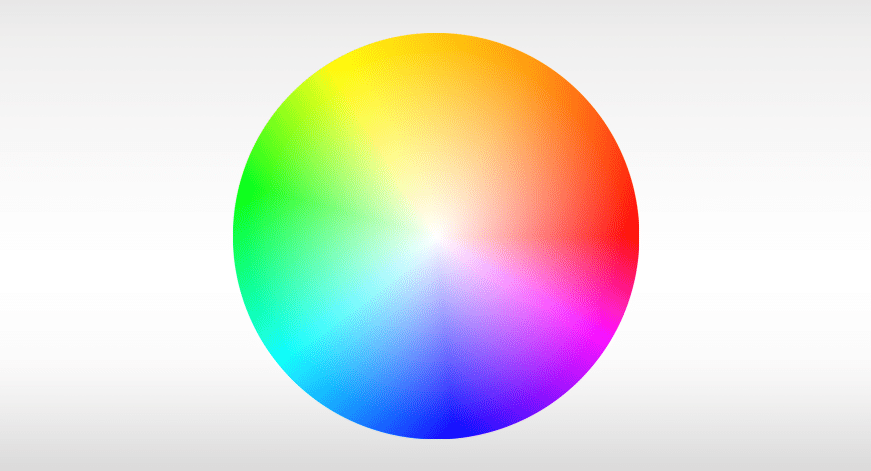
The Colour Wheel is the basis of all colour selections, colour combinations and is used to explain the fundamentals of colour theory. Established by Sir Isaac Newton in 1666 it has stood the test of time – so there must be something to it, right? This visualisation shows all the shades of the primary colours: Green, blue, red, purple, yellow, orange, pink and grey.
Green – popular with brands that are related to the living world and the environment, it evokes a sense of freshness.
Blue – often selected by technology brands it is said to represent integrity, harmony, loyalty and security.
Red – represents good luck in Eastern cultures, it also represents lust, sexuality, a sense of emergency and passion.
Purple – said to evoke feelings of individuality, independence, inspiration and spirituality.
Yellow – the colour most likely to capture attention and stimulate mental activity, it is typically associated with joy and happiness.
Orange – often used to represent sporting brands, it is said to represent adventure and friendship.
Pink – traditionally the colour of love and romance as well as empathy, compassion and nurturing.
Grey – typically viewed as impartial and neutral with no particular emotion attached to it.
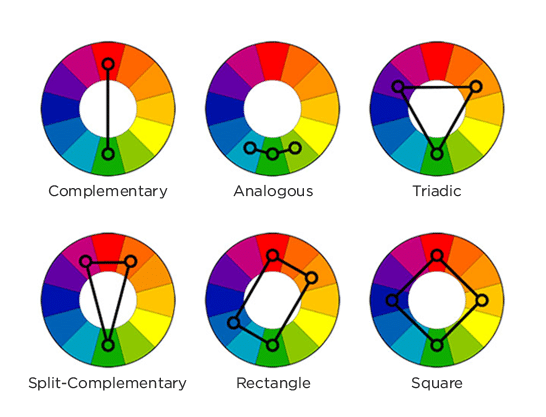
From the colour wheel we have the main colour groups – colours that work together and don’t clash.
Analogous – these colours sit beside each other and create contrast by using different tones.
Split Complementary – these colours are made up of two similar colours and then one contrasting hue.
Complementary – these colours sit opposite each other on the colour wheel and create a strong effect as a high contrast application.
Triad – these colours sit in an even triangle on the colour wheel. This selection works best when one colour dominates the other two.
Monochromatic – these colours are not just shades of grey, contrary to popular belief. These colours are actually just all shades of the same colour.
What does this mean for your brand?
You can use the colour wheel, the significance of particular colours and the colour groups to determine the colours that best represent your brand, products, services, vision and beliefs.
Unsure of the colours that will best represent your new brand or feel that the colours you are currently using just aren’t working? Contact your local brand agency Liquid Creativity today.





Leave a Reply
Your email address will not be published