REBRAND | POSTED ON 06.06.2018
A Look at Crumpler’s Rebrand
Bag designer and manufacturer Crumpler has turned heads in the last couple of weeks with the launch of their rebrand. The local Melbourne brand is evolving and as The Age headline declared the “laptop bag icon grows up”.
Crumpler has well and truly established itself in the area of laptop bags, backpacks, work bags and travel bags in the last few years. Walking the streets of Melbourne, you can spot their bags worn by men in suits, university students and backpackers alike. This is a far cry from the messenger bags aimed at bicycle couriers and messengers that debuted in 1995 when Crumpler launched.
The launch of a new brand identity came with a repositioning of their brand strategy making Crumpler a really interesting case study to examine how a business can do a full rebrand in every sense of the word from design to marketing.
Before the rebrand: Function over fashion
The original range of bags, with their bright colours, clever designs, durability and functionality has evolved to backpacks, suitcases, laptop bags and work bags. With their ever-expanding range of styles and looks, Crumpler realised that their current branding didn’t reflect who they were today.
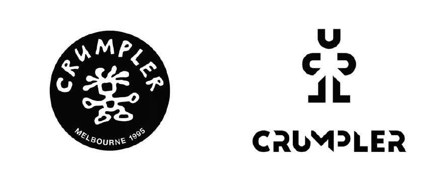
“A lot of our early bags were function over form,” tells Patrick Regester, Marketing Content and Community Coordinator to The Age, “and while function still matters, we want our bags to look awesome.” The same could be said about their iconic red logo with the handwritten typeface and the Crumpler man.

Crumpler marketing materials before the rebrand.
At the time it helped their cool bags stand out from the pack and supported their irreverent marketing approach, but as CEO Adam Wilkinson says, “ As times have changed, and the world has become more connected, our customers have evolved too, and it was time to honour the brand with a refresh and to bring the Crumpler man into the 21st century.”
Evolving Crumpler into the 21st century
All businesses have to evolve to fit the needs of their target audience and to appeal to the contemporary market and while the branding, like their bags were well-known and functioning well, they found the large round, red logo was clashing and not fitting in with the new styles and range of bags they wanted to create.
As bags have become more and more like a piece worn to complement one’s work wear, Crumpler needed to appeal to the fashion, trends and sensibilities of an audience wider than bike couriers and so did their brand identity.
The Crumpler man grows up and gets a haircut
With the launch of “Pronounced Alive”, their newest range of bold, bright futuristic bags, is a more versatile and adaptive logo with the new wordmark taking primary place on the bags and the new Crumpler man – which is made up of the letters in the wordmark – being used more subtly and as a supporting feature.

It’s an edgier brand identity that suggests that Crumpler still plans to be innovative in their designs rather than follow trends of fashion. Their choice of using the wordmark allows for easier adaptability as it can change colours and is less “in your face” as Regester puts it, than the original logo.
This new brand identity is a clever way of making a brand identity more flexible with the vast array of new products and collections for different demographics and it really lets the design of the new bags attract the attention and be the hero.
After the rebrand: A new direction
The Crumpler brand is growing up and is opening itself up to be a bag for a wider range of users for different purposes, and the branding did need to move on and be that new identity.
No longer are their bags just for couriers. Crumpler needed to reflect this change if they want to attract the university student who’s on trend, to the working professional looking for a bag to impress and represent their professional style.


Crumpler’s new Pronounced Alive marketing campaign with the new branding.
Crumpler’s rebrand shows how a business can evolve and still be true to their original values and principles. It highlights the need to continually assess how your brand is perceived in the contemporary market and how you would like your brand to evolve for future growth and expansion.
By repositioning their brand to reach a wider audience and appeal to more people, Crumpler manages to still be an innovative company with a passion to making well designed bags that stand the test of time – and now for Crumpler, has the right brand identity to help them do just that.
____
If your business is thinking of rebranding or wondering if you should rebrand, contact Liquid and let’s chat about what your brand needs.


Leave a Reply
Your email address will not be published