GRAPHIC DESIGN | POSTED ON 12.08.2014
Idlewild’s Bookstore New Brand Concept
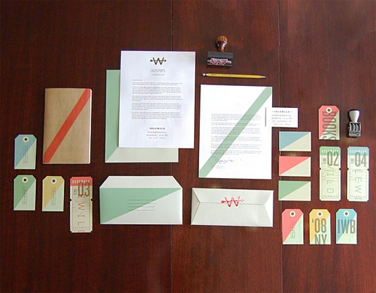
The rebranding of Manhattan’s Idlewild, a bookstore specialised in travel and world literature, started off as a school project for Andrew Colin Beck. During one of his city wanderings he came across the bookstore and was “enchanted by the great selection and themed nature of the store”. When he was later asked to rebrand a company as part of a school project, Beck immediately thought of Idlewild. The existing brand didn’t say anything about their rich heritage or connection to travel, so he started to mine that heritage and brought it to the surface.
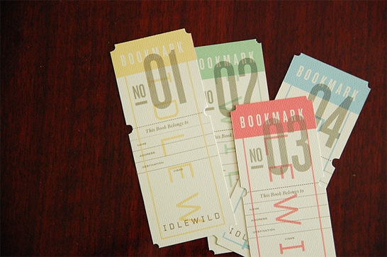
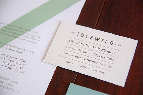
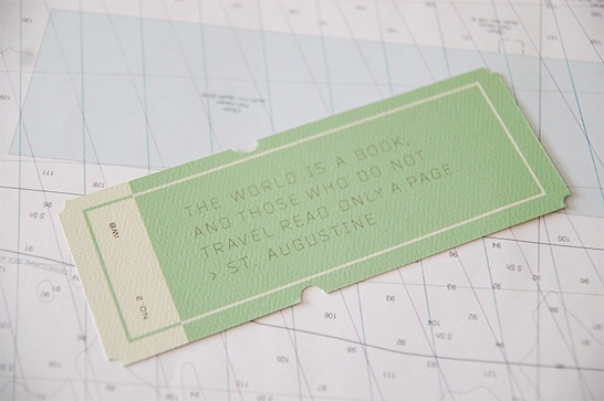
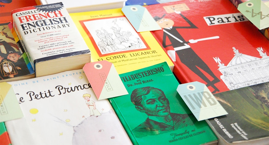
Beck draws inspiration from 1960’s airline tickets, travel brochures and other tourist ephemera, much like the colour palette and typography. Beck also referred to a lot of topographic and flight maps searching for little pieces of visual language. The diagonal band of colours seen in some of the Idlewild business cards and bookmarks came from the dials on the control boards of airplane, called the false horizon.
Beck approached the owner of Idlewild Books, David Del Vecchio, to show him his ideas and Del Vecchio immediately fell in love with the new brand concept and design and decided to adopt it. Idlewild Books is now wearing a fusion of this combined literary and tourist legacy on the sleeve of every book they sell.



Leave a Reply
Your email address will not be published