REBRAND | POSTED ON 27.03.2012
A Cinderella Rebrand that Fits Perfectly on the Customer
At Liquid we love a good Cinderella branding story. It’s hard to believe a serious company like the Biotech Institute would ever use such a logo. The brand established in the 80’s is an overt example of how badly some logos can date. Clearly, it had to go.
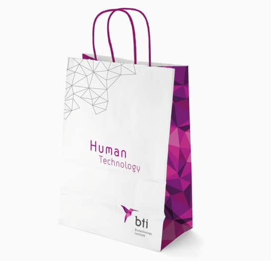
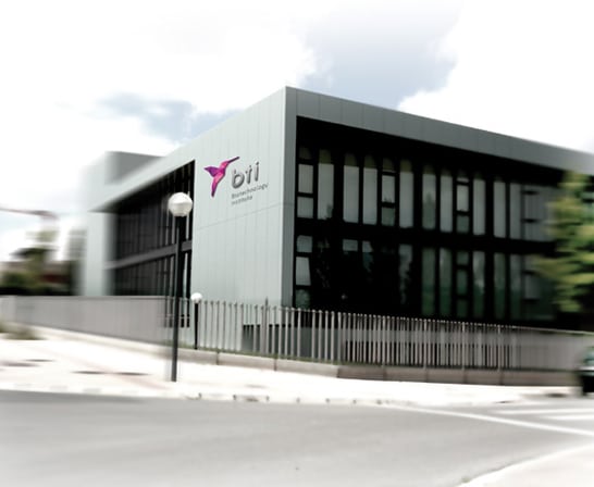
The new logo is infinitely better and adequate for a technology company. The brand is represented by a three-dimensional picture of a hummingbird, origami-textured, intelligent, scientific, modular and scalable. A symbol that depicts the work of nature but also of engineering. As a final touch, the unusual color range stands out for this sector: mauve, purple and pink colors transition from the warmth of the magenta and blue technology. The typography is fine, nothing too absurdly techie but nothing too simple either. The rest of the identity is exactly what you might expect: plenty of white, clinical space with dashes of the fractal texture. Overall, a major and much needed positive transformation.
![]()
 https://liquidcreativity.com.au/wp-content/uploads/2020/08/Build_a_great_brand-02b.png
481
881
Liquid Designers
https://liquidcreativity.com.au/wp-content/uploads/2016/03/liquid_logo.svg
Liquid Designers2020-08-20 15:44:382023-07-19 02:46:11How to build a great brand that’s aligned with your business
https://liquidcreativity.com.au/wp-content/uploads/2020/08/Build_a_great_brand-02b.png
481
881
Liquid Designers
https://liquidcreativity.com.au/wp-content/uploads/2016/03/liquid_logo.svg
Liquid Designers2020-08-20 15:44:382023-07-19 02:46:11How to build a great brand that’s aligned with your business  https://liquidcreativity.com.au/wp-content/uploads/2020/08/Improving_brand_Consistency-scaled.jpg
1384
2560
Liquid Designers
https://liquidcreativity.com.au/wp-content/uploads/2016/03/liquid_logo.svg
Liquid Designers2020-08-02 12:31:232023-07-19 02:45:56What is Brand Consistency & Why Every Business Should Care – Liquid Creativity
https://liquidcreativity.com.au/wp-content/uploads/2020/08/Improving_brand_Consistency-scaled.jpg
1384
2560
Liquid Designers
https://liquidcreativity.com.au/wp-content/uploads/2016/03/liquid_logo.svg
Liquid Designers2020-08-02 12:31:232023-07-19 02:45:56What is Brand Consistency & Why Every Business Should Care – Liquid Creativity https://liquidcreativity.com.au/wp-content/uploads/2020/01/Profiling-brand-personality-1.png
482
882
Liquid Designers
https://liquidcreativity.com.au/wp-content/uploads/2016/03/liquid_logo.svg
Liquid Designers2020-02-26 10:08:172023-07-19 02:45:25Brand Profiling: Building a Consistent Brand With a Compelling Personality
https://liquidcreativity.com.au/wp-content/uploads/2020/01/Profiling-brand-personality-1.png
482
882
Liquid Designers
https://liquidcreativity.com.au/wp-content/uploads/2016/03/liquid_logo.svg
Liquid Designers2020-02-26 10:08:172023-07-19 02:45:25Brand Profiling: Building a Consistent Brand With a Compelling Personality https://liquidcreativity.com.au/wp-content/uploads/2020/01/Project-your-brand-management.png
482
882
Liquid Designers
https://liquidcreativity.com.au/wp-content/uploads/2016/03/liquid_logo.svg
Liquid Designers2020-02-11 09:21:132023-07-19 02:45:11Brand Management: Process and Responsibilities
https://liquidcreativity.com.au/wp-content/uploads/2020/01/Project-your-brand-management.png
482
882
Liquid Designers
https://liquidcreativity.com.au/wp-content/uploads/2016/03/liquid_logo.svg
Liquid Designers2020-02-11 09:21:132023-07-19 02:45:11Brand Management: Process and Responsibilities https://liquidcreativity.com.au/wp-content/uploads/2019/11/Brand-audit-does-your-business-need-a-brand-refresh.png
481
881
Liquid Designers
https://liquidcreativity.com.au/wp-content/uploads/2016/03/liquid_logo.svg
Liquid Designers2019-11-25 10:53:072023-07-19 02:44:36Brand Audit: Does Your Business Need a Brand Refresh?
https://liquidcreativity.com.au/wp-content/uploads/2019/11/Brand-audit-does-your-business-need-a-brand-refresh.png
481
881
Liquid Designers
https://liquidcreativity.com.au/wp-content/uploads/2016/03/liquid_logo.svg
Liquid Designers2019-11-25 10:53:072023-07-19 02:44:36Brand Audit: Does Your Business Need a Brand Refresh? https://liquidcreativity.com.au/wp-content/uploads/2019/09/sync-branding-marketing.png
472
872
Liquid Designers
https://liquidcreativity.com.au/wp-content/uploads/2016/03/liquid_logo.svg
Liquid Designers2019-09-09 09:27:202023-07-19 02:44:17Why Branding is Important in Marketing
https://liquidcreativity.com.au/wp-content/uploads/2019/09/sync-branding-marketing.png
472
872
Liquid Designers
https://liquidcreativity.com.au/wp-content/uploads/2016/03/liquid_logo.svg
Liquid Designers2019-09-09 09:27:202023-07-19 02:44:17Why Branding is Important in Marketing

Leave a Reply
Your email address will not be published