LOGO | POSTED ON 21.05.2015
Hillary Clinton’s New Logo
Gone are the days of politicians campaigning solely on credentials and policies. Now it’s just as much about the politician as a brand. With the US Presidential Election already picking up momentum, we look at the brand and more specifically the logo of Presidential candidate, Hillary Clinton.
In line with launching her bid to be President, a new logo was launched, but it’s not as simple as it sounds.
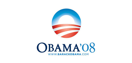
When Barack Obama ran for President his logo was highly patriotic to offset questions about his unusual name and background – it showed he was all about America and what it stood for.
Coming from being a previous First Lady, there was little question about Hillary Clinton’s background, particularly for those of us that lived through the 90s – so the question was how to differentiate Hillary from Bill, from the past and to appeal to and engage with a new generation of voters and a very different America to the one her husband governed.
The logo, while called amateurish by some, first appeared strong yet confusing to many.
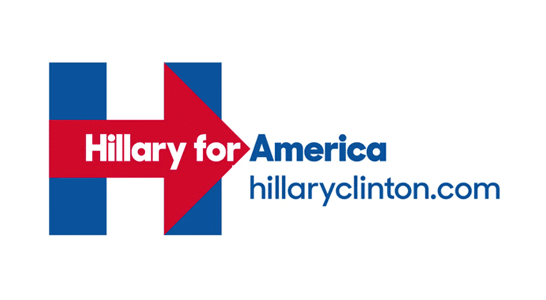
With or without the text, the originally launched logo had many questioning the use of the colour red (the colour of her opponents) and the arrow moving to the right (does it mean moving forward or moving to the right in political terms?). And over on social media platforms people also saw symbolism between the logo and a plane flying into the Twin Towers – while that seems laughable to most, it is concerning that many people didn’t seem to engage with the logo and sought to pull it to pieces – piece by piece? The H with an arrow stirred up lots of commentary. It got people asking questions and making comment both negative and positive.
It does beg the question of how much feedback they sought on the logo prior to launch. Did no one question the colour choices? Did no one question the potential meanings of the arrow? It reinforces to us the absolute importance of obtaining objective feedback and lots of it before sending a logo (or a brand) live.
And still being 19 months away from the election it looks like we’ll be seeing many variations of Hillary’s logo.
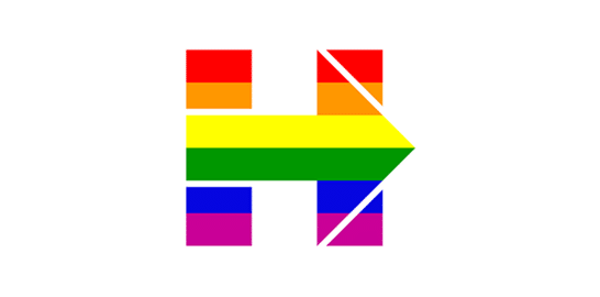
This week saw the launch of a rainbow coloured logo in support of marriage equality (above), the logo on a background of wheat fields in Iowa and mountains in New Hampshire (below).
![]()
It’s a little too soon to gauge the success of the logo – it ticks some boxes (it’s simple, it works at different sizes) but not others (it’s being changed so often it may struggle to gain recognition, it may imply messages that are not necessarily correct) so I guess we’ll have to wait and see how pans out over the next year and a half. Whether you love it or hate it, you have to admit, it’s definitely getting people talking and starting to define the issues that are important to Hillary and her campaign (the brand story); sometimes that’s half the battle won.
What do you think of Hillary’s new logo?
If you’re in the market for branding, rebranding and your logo design is part of that process, contact your local brand agency Liquid Creativity for advice.




Leave a Reply
Your email address will not be published