DESIGN EFFECTIVENESS | POSTED ON 17.09.2015
How Imagery Can Tell a Complex Story
Data visualisation is a form of visual communication in which data is presented in a graphical or pictorial format. Presenting complex data sets in a visual way helps readers to comprehend and analyse the information set more clearly and efficiently; imagery can tell a complex story.
Why is Data Visualisation important?
Imagine presenting an enormous spreadsheet with row after row, and column after column of data points. Chances are you’re struggling to make sense of it all so how can you possibly expect your readers to? You have all this valuable, collected, verified data so the trick now is to show it off in an easily understandable and easily digestible manner. Through pictorial and graphical representations you can help people make sense of large amounts of data quickly, you can show trends and patterns making then readily identifiable.
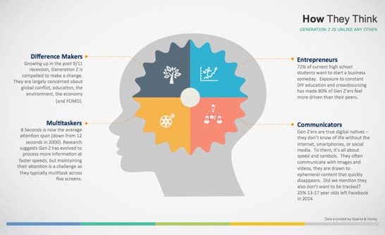
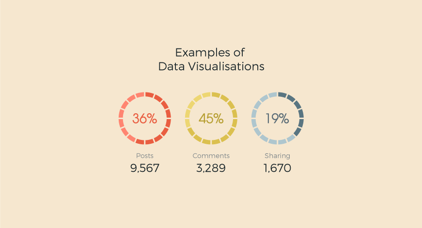
Great visuals can enhance, strengthen and add another element to a complex story. Just remember that not all data visualisations are created equal; there are some truly horrid, boring, confusing examples out there; to really work your data visualisations need to have both substance and style. Here are some great examples of how to use data visualisations:
Using real life examples to demonstrate the data

Infographics – lots of data contained in a simple to digest manner

Do you have a lot of data to present in an easily understandable, digestible format? Contact your local brand agency Liquid Creativity team.


Leave a Reply
Your email address will not be published