DESIGN EFFECTIVENESS | POSTED ON 17.05.2013
Longview’s Packaging Redesign Calls for a Toast
Longview Vineyard is a family owned and operated winery in the town of Macclesfield in the Adelaide Hills. It has established itself as one of the most awarded vineyards in the region.
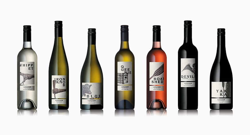
Longview has been reinvigorated by the Saturno family who invested into the established winery in 2001. They realised that it was time to give the existing labels which were common and uninspiring a new look, as they thought that their dated packaging could not survive in such a highly competitive industry. Longview decided to redesign their entire range of packaging with the aim of portraying a message of quality and uniqueness and increasing sales amongst their 25-45 year old target audience.
Each distinctly shaped bottle has a unique illustration which draws on the brand personality and the name of the wine. This is consistent throughout the range, giving them a common appearance yet each one remains distinctive. These illustrations each tell a story behind the wine. This gives the bottles more depth and creates an interest for the consumers, drawing them into the region and allowing them to seek out more information about the brand.
Longview was rewarded for their new packaging as results showed a massive increase in sales. The new labels were engaging and different from their competitors as they stood out. The total sales in 2008-2009 were 9,879 cases domestically across 31 different labels. After the repackaging, domestic sales have increased to 14,787 cases across 17 different labels. They also expanded their exportation to 8 markets, previously 1, increasing international sales to over 6,000 cases. Their new, fresh and vibrant labels enabled them to become a more desired brand.


Leave a Reply
Your email address will not be published