
PACKAGING | POSTED ON 01.06.2012
A Brand ‘Pot of’ Difference On and Off the Shelf
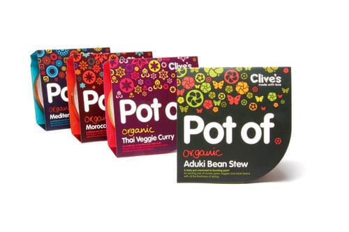
Clive’s new ‘Pot of’ range of fresh organic meals has recently completed a naming, rebrand and packaging design. This fresh brand challenges packaging design in this market, currently saturated with uninspiring international brands and bland own label products. Through distinct differentiation, Clive’s has expanded and diversified their product range. The bold, highly graphic, brand identity based on symbology, pattern and colour associated with each recipe’s origin creates a real visual point of difference. The eye-catching design is distinctive and communicates beautifully, on and off the shelf.
 https://liquidcreativity.com.au/wp-content/uploads/2016/02/mova_icecream01.jpg
471
871
Liquid Designers
https://liquidcreativity.com.au/wp-content/uploads/2016/03/liquid_logo.svg
Liquid Designers2014-08-26 14:50:162022-10-20 18:07:27US Market – Meet our Clean Packaging Design
https://liquidcreativity.com.au/wp-content/uploads/2016/02/mova_icecream01.jpg
471
871
Liquid Designers
https://liquidcreativity.com.au/wp-content/uploads/2016/03/liquid_logo.svg
Liquid Designers2014-08-26 14:50:162022-10-20 18:07:27US Market – Meet our Clean Packaging Design https://liquidcreativity.com.au/wp-content/uploads/2016/02/evian_01.jpg
471
871
Liquid Designers
https://liquidcreativity.com.au/wp-content/uploads/2016/03/liquid_logo.svg
Liquid Designers2014-08-11 09:21:482022-10-20 19:37:24New Evian Bottle Design is Sleek and Clean
https://liquidcreativity.com.au/wp-content/uploads/2016/02/evian_01.jpg
471
871
Liquid Designers
https://liquidcreativity.com.au/wp-content/uploads/2016/03/liquid_logo.svg
Liquid Designers2014-08-11 09:21:482022-10-20 19:37:24New Evian Bottle Design is Sleek and Clean https://liquidcreativity.com.au/wp-content/uploads/2016/02/blue_goose_07.jpg
471
871
Liquid Designers
https://liquidcreativity.com.au/wp-content/uploads/2016/03/liquid_logo.svg
Liquid Designers2014-07-11 11:46:262022-10-20 18:33:23Blue Goose new packaging is naturally good
https://liquidcreativity.com.au/wp-content/uploads/2016/02/blue_goose_07.jpg
471
871
Liquid Designers
https://liquidcreativity.com.au/wp-content/uploads/2016/03/liquid_logo.svg
Liquid Designers2014-07-11 11:46:262022-10-20 18:33:23Blue Goose new packaging is naturally good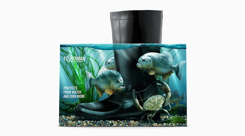 https://liquidcreativity.com.au/wp-content/uploads/2016/02/fisherman_01.jpg
471
871
Liquid Designers
https://liquidcreativity.com.au/wp-content/uploads/2016/03/liquid_logo.svg
Liquid Designers2014-07-07 16:18:552022-10-20 22:12:55These Boots Are Made For Walking (On Water)
https://liquidcreativity.com.au/wp-content/uploads/2016/02/fisherman_01.jpg
471
871
Liquid Designers
https://liquidcreativity.com.au/wp-content/uploads/2016/03/liquid_logo.svg
Liquid Designers2014-07-07 16:18:552022-10-20 22:12:55These Boots Are Made For Walking (On Water)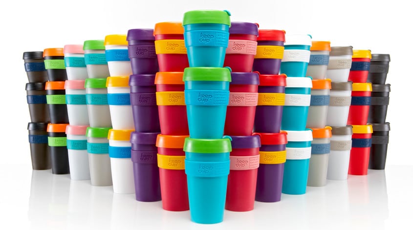 https://liquidcreativity.com.au/wp-content/uploads/2016/02/keepcup_01.jpg
471
871
Liquid Designers
https://liquidcreativity.com.au/wp-content/uploads/2016/03/liquid_logo.svg
Liquid Designers2014-07-01 11:01:062021-10-25 17:55:03A Brand Strategy to Keep(Cup) – Branding Strategies to Grow Your Business
https://liquidcreativity.com.au/wp-content/uploads/2016/02/keepcup_01.jpg
471
871
Liquid Designers
https://liquidcreativity.com.au/wp-content/uploads/2016/03/liquid_logo.svg
Liquid Designers2014-07-01 11:01:062021-10-25 17:55:03A Brand Strategy to Keep(Cup) – Branding Strategies to Grow Your Business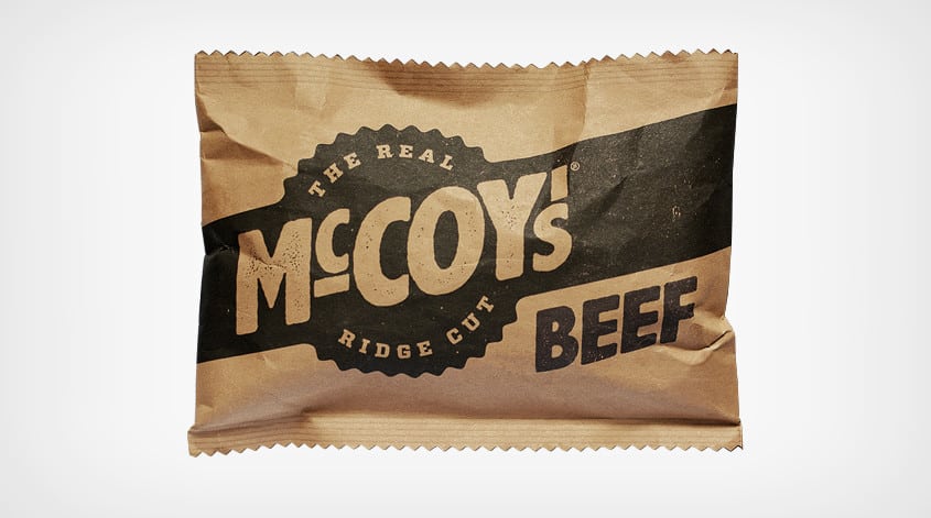 https://liquidcreativity.com.au/wp-content/uploads/2016/02/mccoys01.jpg
471
871
Liquid Designers
https://liquidcreativity.com.au/wp-content/uploads/2016/03/liquid_logo.svg
Liquid Designers2014-06-17 09:27:592022-10-20 22:07:46The Real Man’s Chips
https://liquidcreativity.com.au/wp-content/uploads/2016/02/mccoys01.jpg
471
871
Liquid Designers
https://liquidcreativity.com.au/wp-content/uploads/2016/03/liquid_logo.svg
Liquid Designers2014-06-17 09:27:592022-10-20 22:07:46The Real Man’s Chips

Leave a Reply
Your email address will not be published