LOGO | POSTED ON 29.01.2012
Starbucks New Logo Smells Like Success in the Morning
Last year, Starbucks – the worlds largest coffee chain revealed an updated logo, removing it’s ‘Starbucks Coffee’ wordmark.
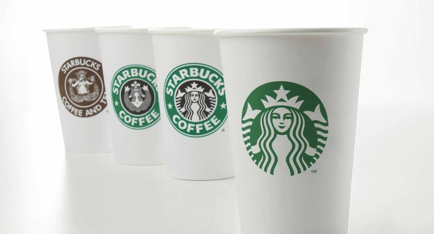
The logo retains the memorable mermaid/siren that has served as Starbucks’ icon since the company’s formation 40 years ago.
Mike P., a senior creative manager at Starbucks explains how the new logo came to be:
“When we first heard about the possibility of modifying the Starbucks brand identity, our minds went wild with the possibilities… we broke down the four main parts of the mark — color, shape, typeface and the Siren. After hundreds of explorations, we found the answer in simplicity. Removing the words from the mark, bringing in the green, and taking the Siren out of her ring. For forty years she’s represented coffee, and now she is the star.”

Starbucks now joins the ranks of Nike, McDonald’s, Apple, and Target – a select few global brands that are recognizable enough to get away without a wordmark.
It must have been a leap of faith for Starbucks to change the brand with a wordless refresh – but as a company that prints its logo on billions of paper cups worldwide each year, it’s a pretty safe bet that consumers will adjust.
It’s interesting to see the evolution of the Starbucks ‘siren’. The initial logo was based on the imagery of a 16th century Norse woodcut of a twin-tailed mermaid, and was chosen as a way to capture the seafaring history of coffee and Seattle’s strong seaport roots – thus to create a brand story.
The logo imagery had gone through 4 variations during it’s 40 year journey, changing in modesty, colour and clarity alike.
So is the refreshed logo a success? We think so. It is the clarity and simplicity of this archetypal illustration, that has achieved success in all key areas of logo effectiveness:
a. distinctiveness
b. visibility
c. useability
d. memorability
e. universality
f. durability
g. timelessness


Leave a Reply
Your email address will not be published