LOGO | POSTED ON 03.02.2010
Olympic Logo Failure: Who Invited Bart and Lisa?
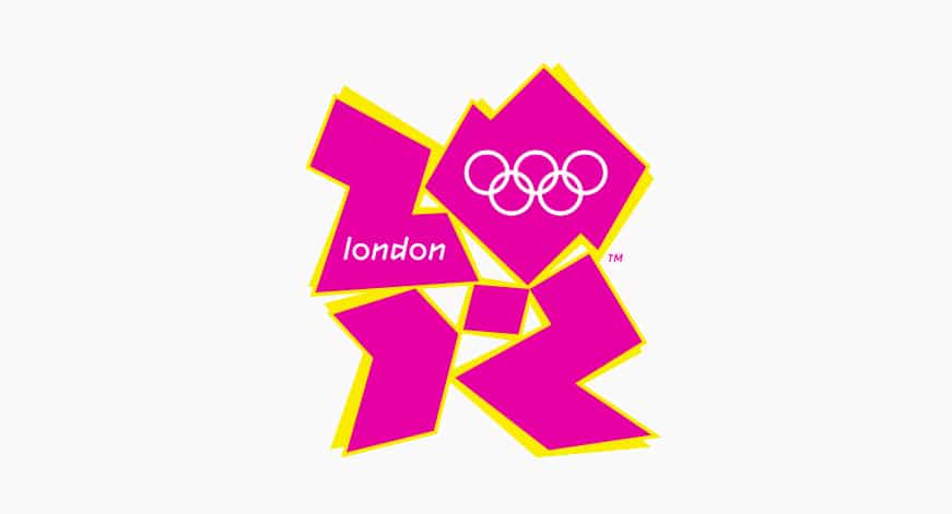
London’s 2012 Olympic logo was specifically designed to appeal to a young, hip audience but research shows that London teenagers do not respond to it at all. Although the logo was designed with their interests in mind they actually feel insulted that it shows no understanding of their culture. London teenagers are proud, they love their city and they’re savvy about branding. They’re well aware of the brands they connect with and the ones they don’t and they feel embarrassed by the image the London Olympic logo is projecting of their city.
FAQs
- What is meant by “Olympic Logo Failure: Who Invited Bart and Lisa?”
- This phrase likely refers to a controversial or poorly received Olympic logo design that reminded people of characters from “The Simpsons,” specifically Bart and Lisa Simpson. It suggests that the design was seen as amateurish or inappropriate for the prestigious event.
- Which Olympic logo is being referred to in this context?
- The phrase most likely refers to the 2012 London Olympics logo, which faced significant public criticism and mockery. Some people compared the abstract design to various unrelated and humorous images, including characters from “The Simpsons.”
- Why was the 2012 London Olympics logo considered a failure by some?
- The 2012 London Olympics logo was considered a failure by some due to its unconventional and abstract design, which many found confusing and unappealing. Critics argued that it didn’t effectively represent the spirit of the Olympics and was difficult to interpret.
- What was the intended symbolism behind the 2012 London Olympics logo?
- The 2012 London Olympics logo was intended to represent the dynamic and diverse nature of London. Its jagged, abstract design aimed to capture the energy and modernity of the city, as well as the spirit of the upcoming Games. The design included the year “2012” in a stylized form.
- How did the public and media react to the 2012 London Olympics logo?
- The public and media reaction to the 2012 London Olympics logo was largely negative. Many people found it visually unappealing and confusing, and it became the subject of widespread ridicule and parody. However, some appreciated its bold and unique approach, recognizing it as a departure from traditional Olympic logos.
4o
Categories
Related Posts
How to create a memorable brand logo: tips and tricks
Learn how to create a logo that connects with your target audience and represents your business with our lessons and examples.
Is My Brand Okay?
Some businesses find branding intimidating, we take a look at a recent case study and guide you through how to determine if your brand needs help.
Your Business Needs a Brand Visual Language
Businesses can no longer rely on a simple style guide to maximise their brand's power, a brand visual language ensures all you are sending the right messages across all your visuals.
A Look at Crumpler’s Rebrand
From friendly, colourful bike messenger bags to cutting edge fashionable accessories, we take a look at Crumpler's recent rebrand and examine how a brand evolves for the contemporary market.
How to Build a Brand: A Business Owner’s Guide
In today’s world of global brands battling it out with an ever-increasing number of start-ups, a beautifully built brand is a necessity. Here's our starter guide to building a brand out of your business.
Pulse: Creating a Brand for a New Digital Platform
When MMG approached us about creating a brand for their new communications platform, we wanted to make sure that the brand endures. This is the story of how Liquid created the Pulse brand.
Leave a Reply
Your email address will not be published